Cashiers Historical Society
Cashiers, NC USA
2013–2014
Visual Identity
Brand Guidelines
Cashiers Historical Society oversees the preservation of more than 100 historical buildings in the mountains of Western North Carolina. CHS also functions as a central hub for community events centered around the history of the region. In 2013, CHS commissioned a new visual identity spanning all aspects of their operations in order to improve their outreach to a wider, more contemporary audience.

Prior to the new visual identity, CHS had been using a traditional monochrome insignia that was inaccessibly formal and seemed quite literally sealed off from the public. The new logo needed to be entirely open and embracing, encouraging accessibility and expressing CHS's commitment to community outreach.
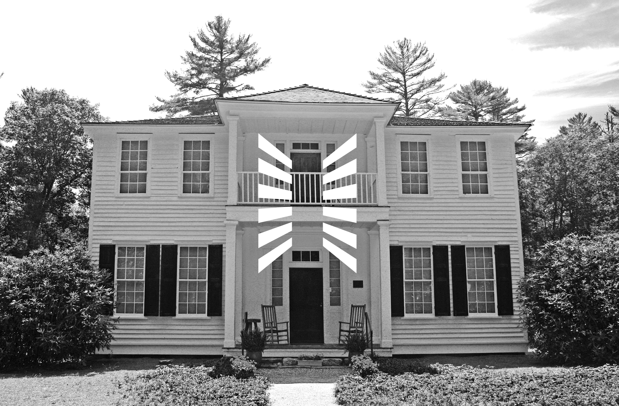
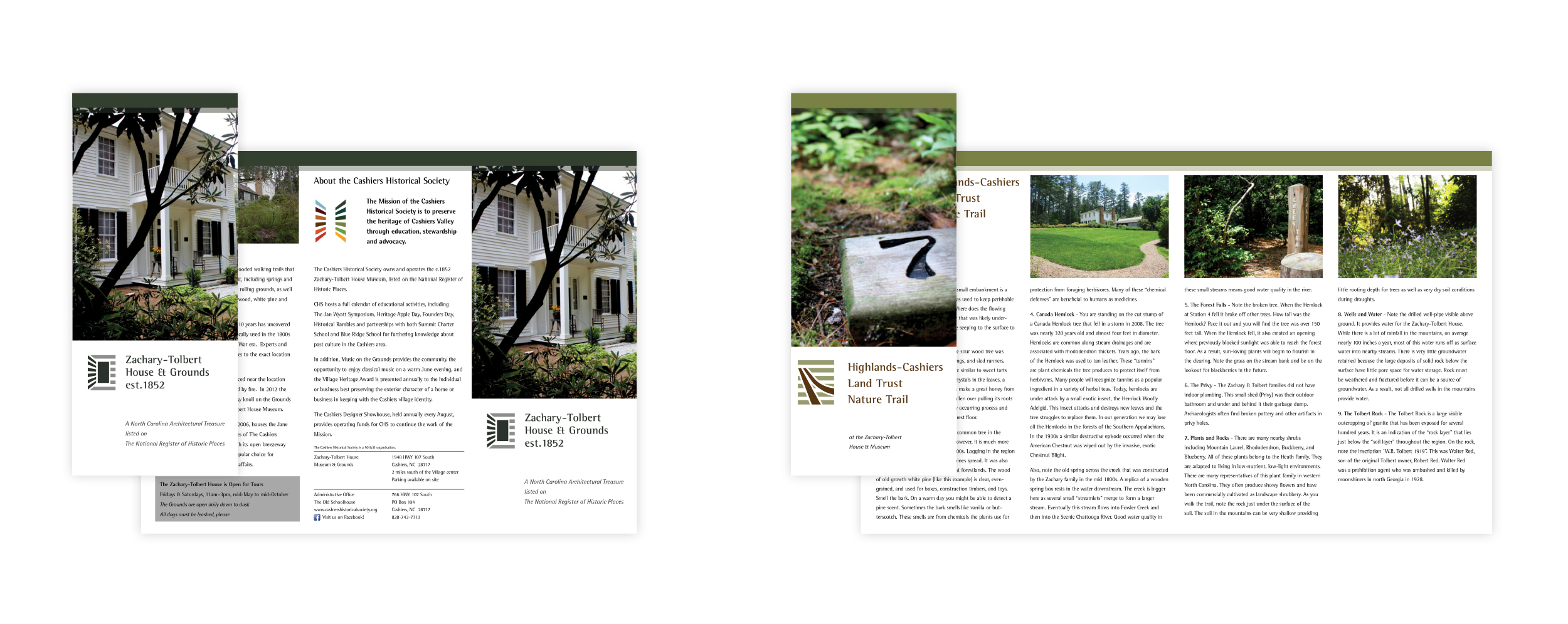
The form of the logo was derived from architectural details found on CHS's crown jewel, the Zachary-Tolbert House. Listed on the National Register of Historic Places, the Z-T House was built in 1852 and stands as one of the most exquisite examples of Greek Revival architecture in the United States. Borrowing from its symmetrical design and iconic shutters, the new logo actively opens itself to the public.

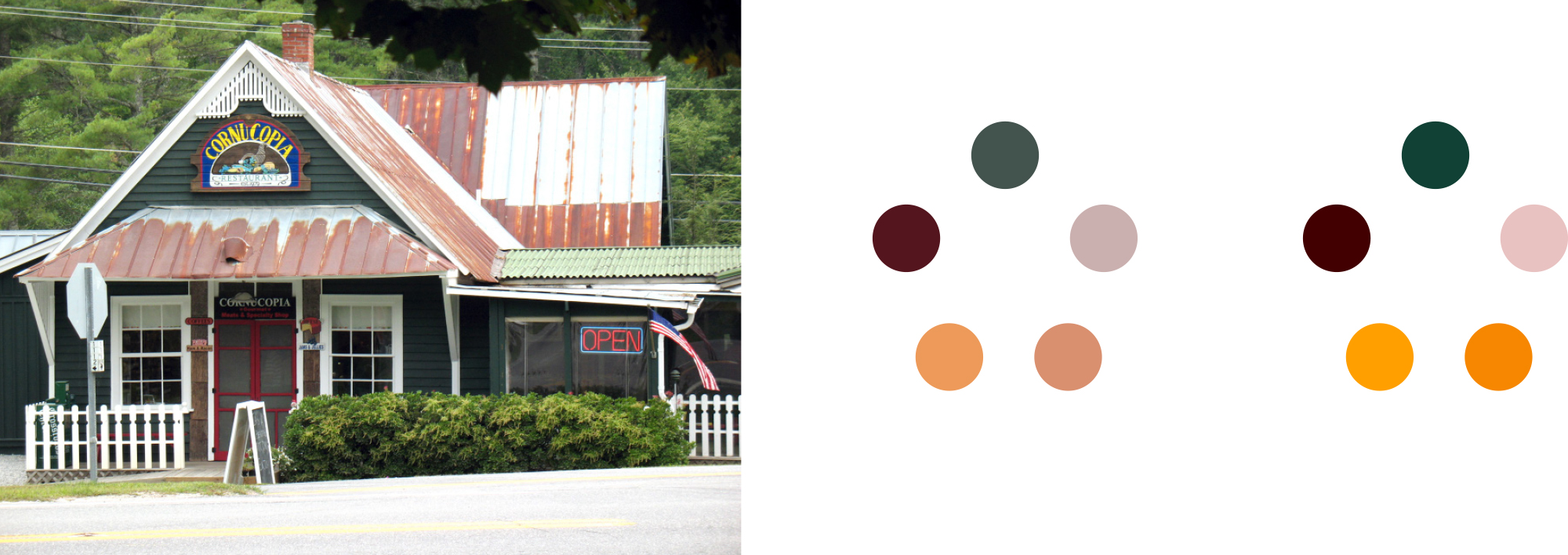
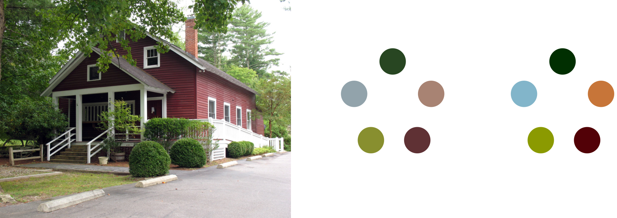
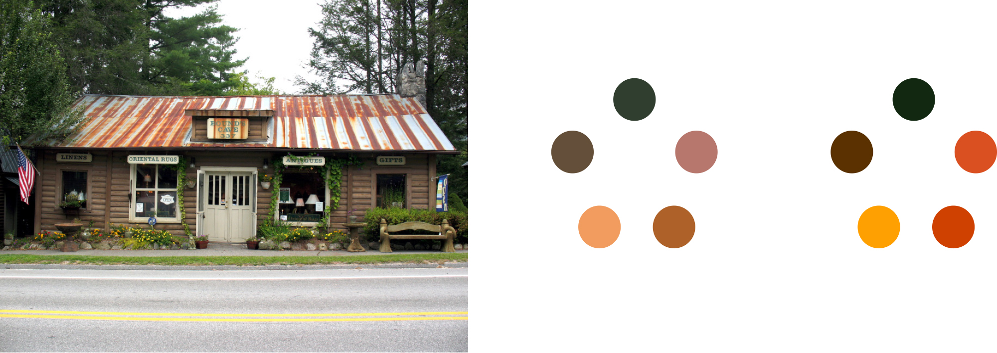

The heart and soul of the new visual identity is color. Multiple color palettes were created using swatches taken from the historical buildings themselves. The palettes were then combined to create a broad spectrum of color representative of the different sites and the natural environment that surrounds them.
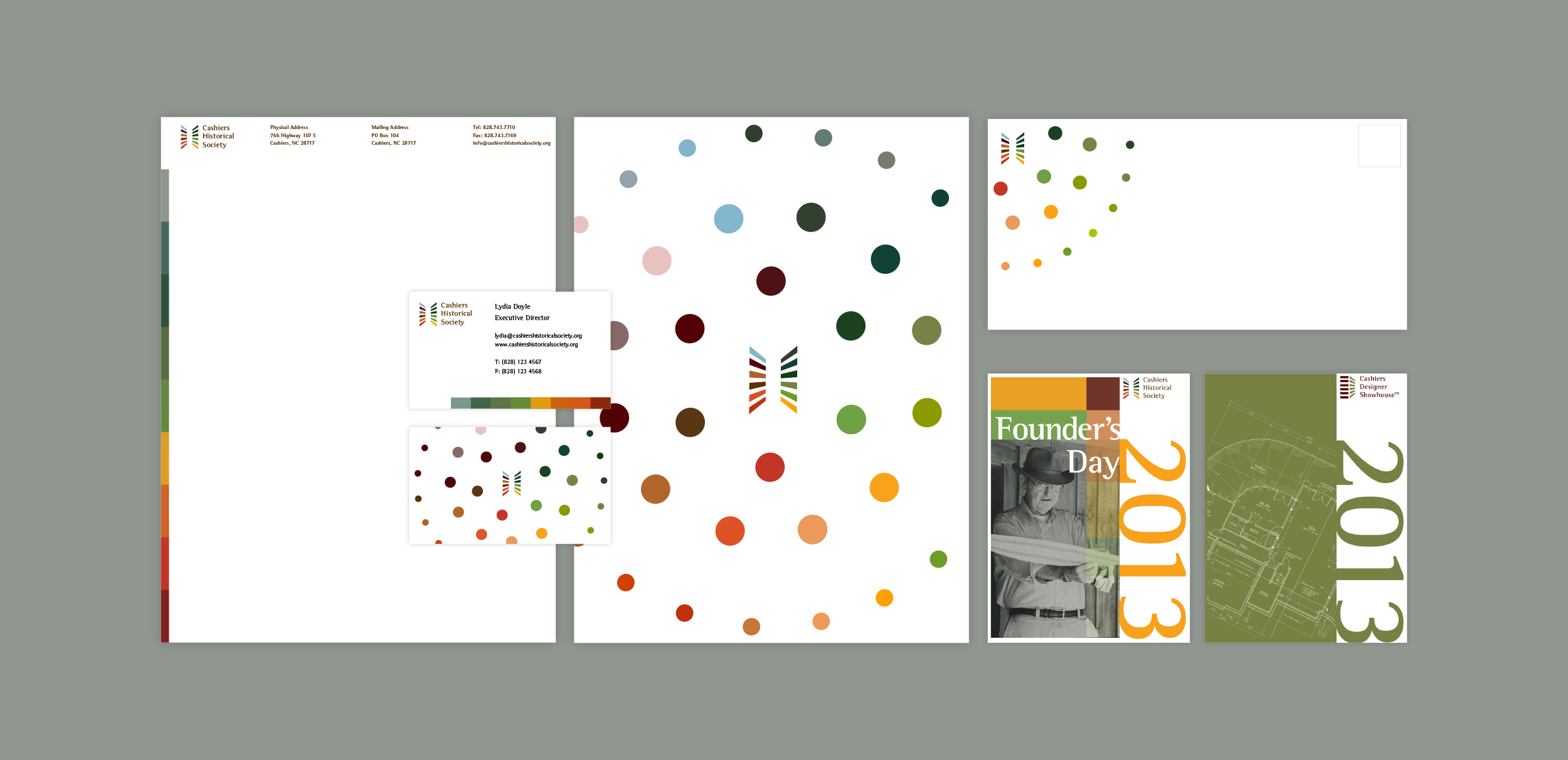
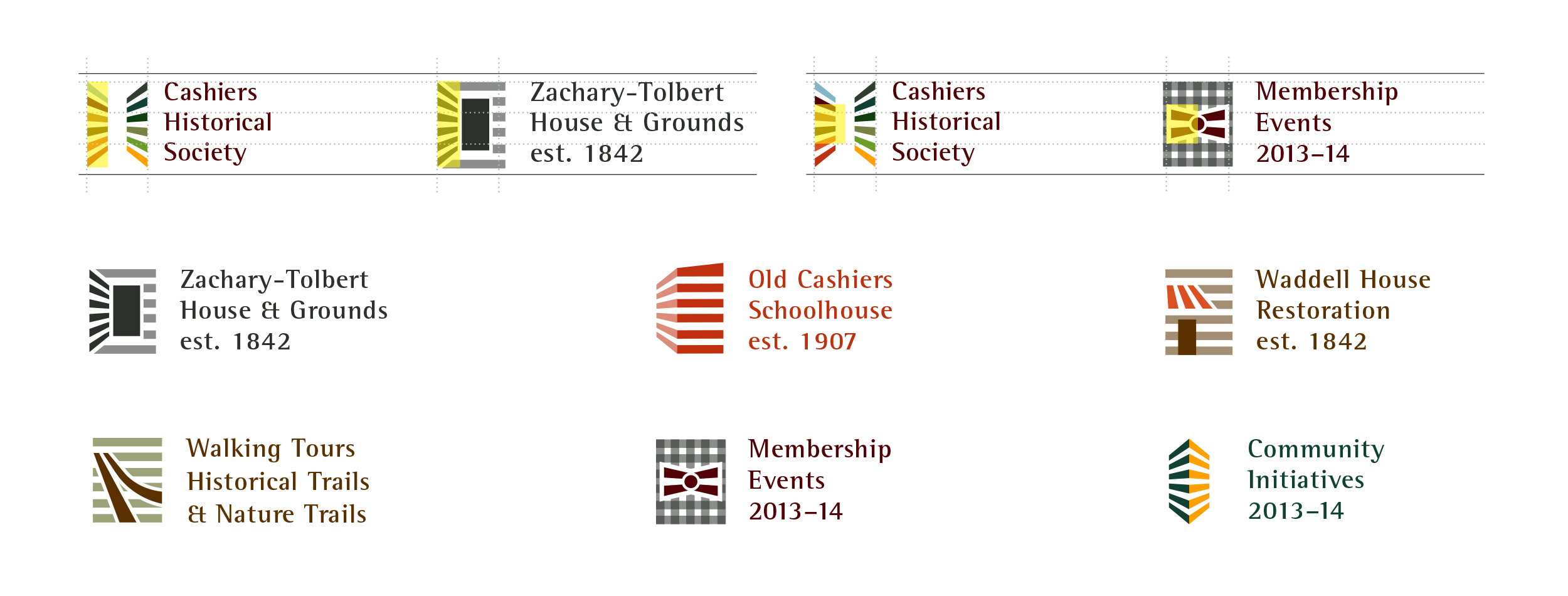
The architectural elements of the logo are used to create a system of sub-logos representing the different historical sites, as well as other programs and initiatives.
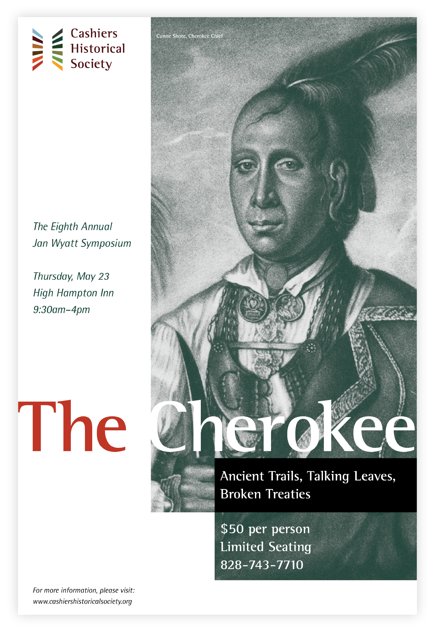
Poster created on the occasion of CHS's annual Symposium lecture series.
Copyright © Jaymes Moore 2011–2020