Humanizing the world at work—Since 2004, LinkedIn has grown from 1 million users to over 700 million, evolving from a corporate networking platform to the world's most recognized hub for professional content. However, their brand had not evolved at the same pace as their platform. Research showed that their increasingly diverse user base perceived LinkedIn as a "faceless blue man" and the epitomy of the corporate 9–5. This misconception revealed that the brand needed to make an intentional shift to better relate to their users and reflect the thriving diversity of cultures and professions represented on their platform.
As Design Director, I was the design lead on the project and played a critical consulting role in uniting internal teams spanning brand, marketing and product and ensuring the visual identity met each of their design imperatives.
Visualizing Warmth & Humanity
In order to act upon their mission of providing economic opportunity for everyone, the primary design objective was to craft a Visual Identity that brings warmth and humanity to the world at work, while better reflecting the diversity of the platform.
At the heart of the system is the intentional diversification of color, expanding the brand's expressive capability and injecting a much-needed dose of warmth and approachability.
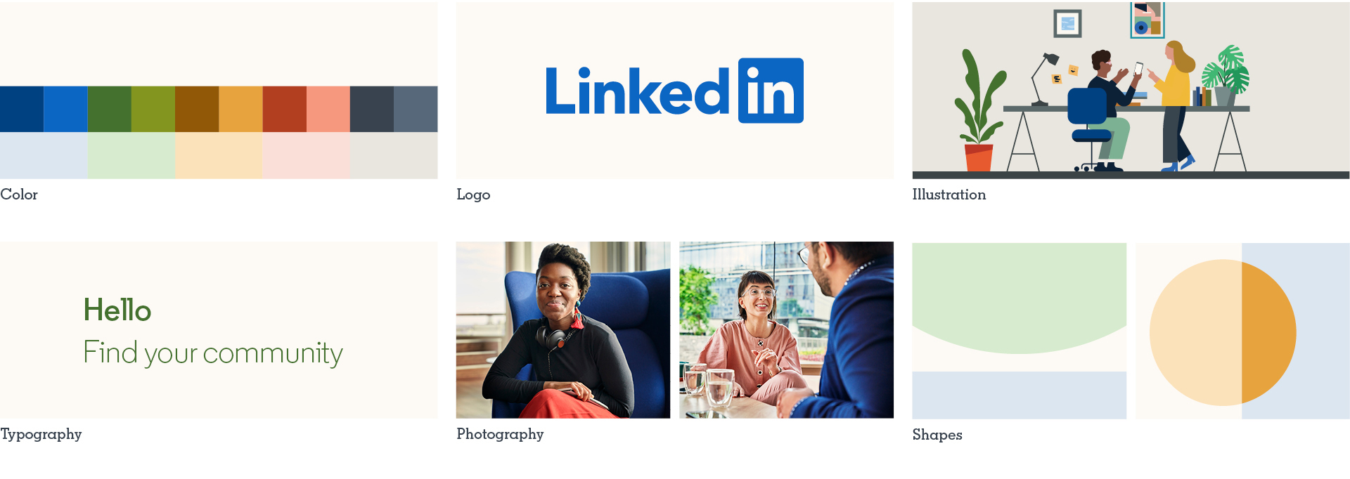
Community Type Family
Working wtih A-2 Type Foundry in London, we developed a bespoke family of typefaces called Community. To better reflect the spirit of dialogue and exchange on the platform, the typeface was purposely designed to appear friendly and conversational, whose light weights are meant to be used at large headline sizes, while tight tracking allows for maximum space efficiency.
Shapes System
The visual DNA of the shape system is rooted in the idea that the two 'i's in the logo make a 'we,' from which a shape-driven visual language brings to life the many interactions and exchanges that happen between users on the platform. The shape system allows the brand to have a vast expressive range, from simple type-driven compositions to dynamic interactions between shape and image.
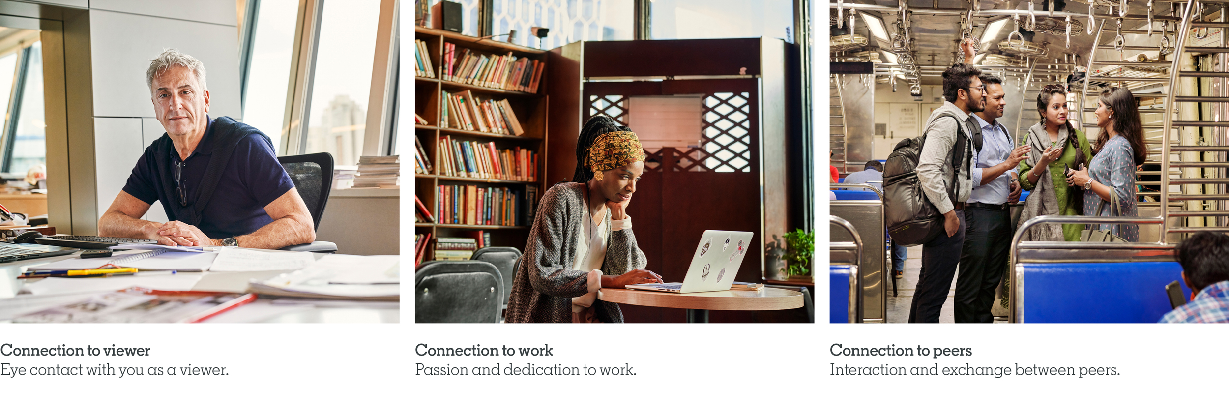
Three Points of Connection
To ensure photography captures the world at work in a way that feels authenitc and relatable, we developed a principle-based approach around three points of connection. After conducting a successful test shoot, the principles were implemented by LinkedIn's Creative Studio to capture an immense global photo library. The images below are just a small excerpt of the thousands of proprietary images in the library.
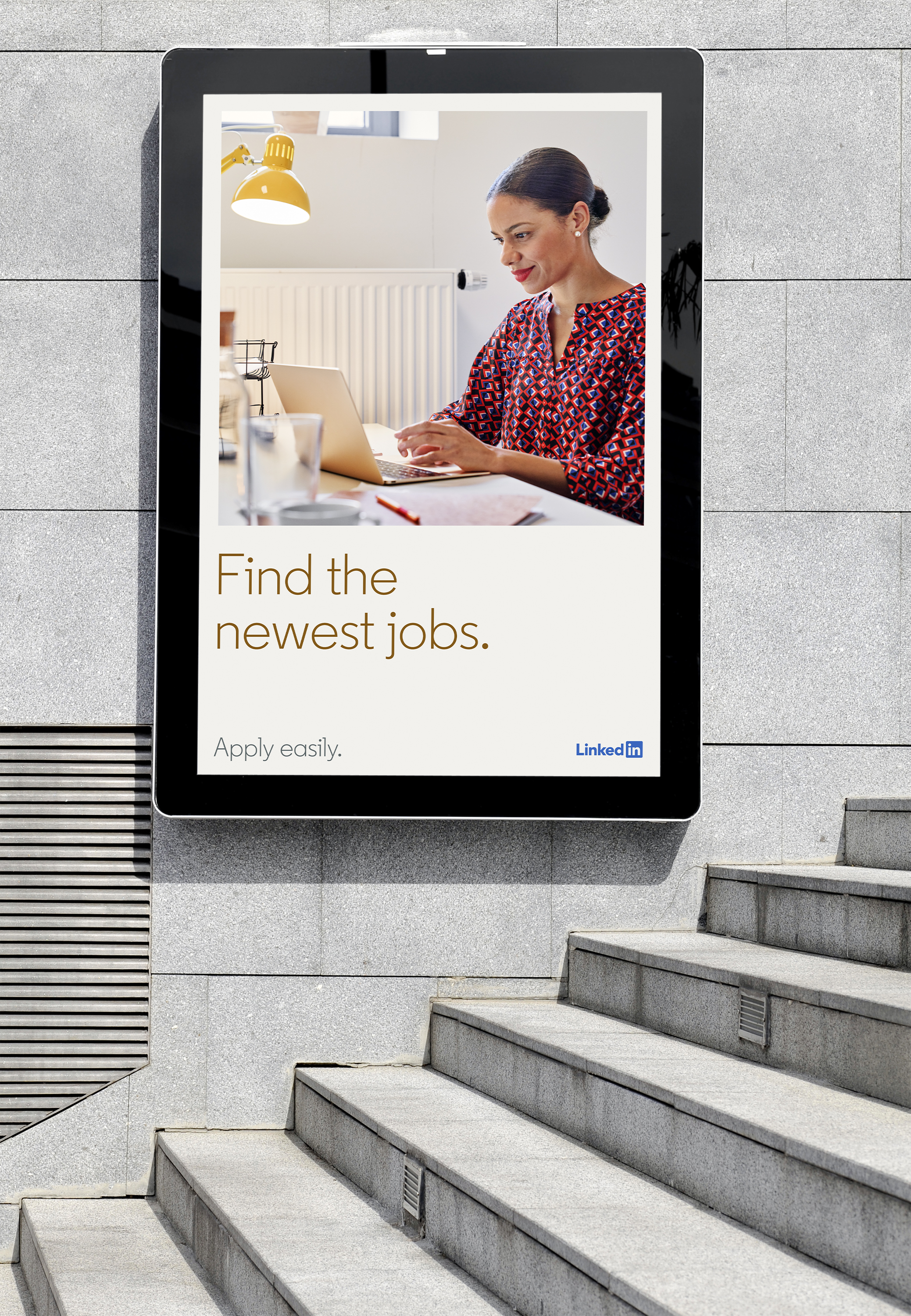
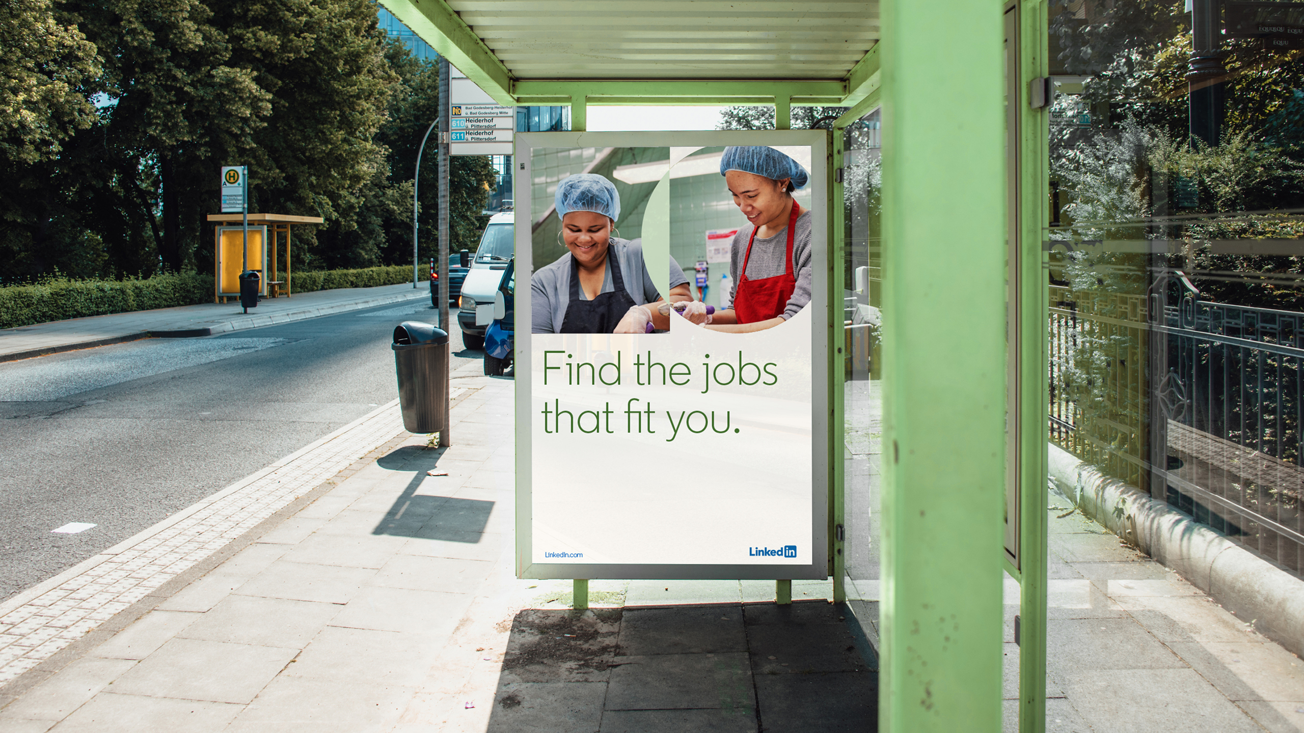
Illustrating the World at Work
As an additional mode of expression to photography, illustration is a critical tool for the brand to be able to relate more abstract ideas and present more inclusive scenarios. Working with illustrator Jamie Jones, we devised a 'master illustration' approach, consisting of a large illustrated world whose many mise-en-scène moments can be extracted for storytelling purposes in product and marketing.
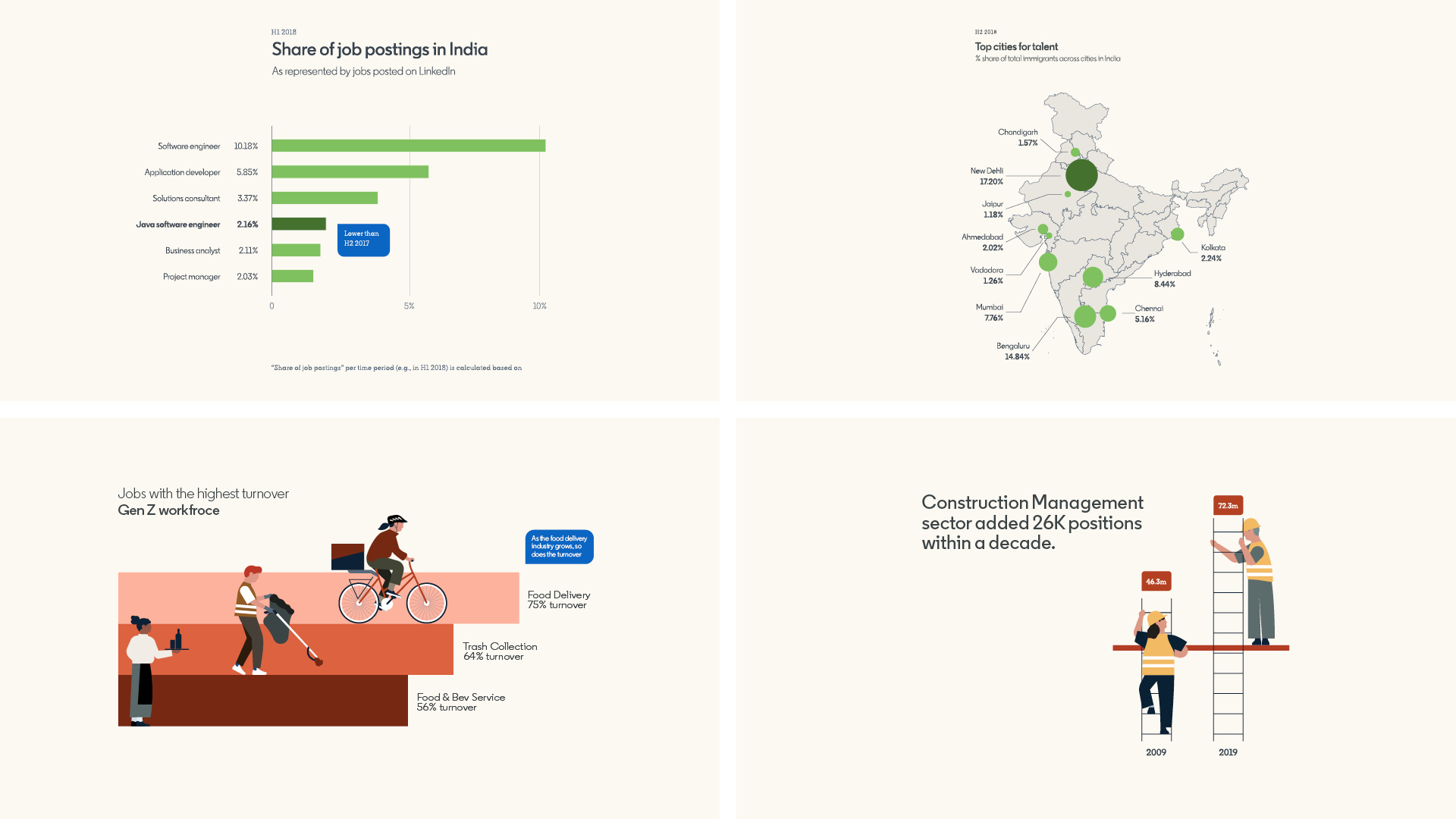
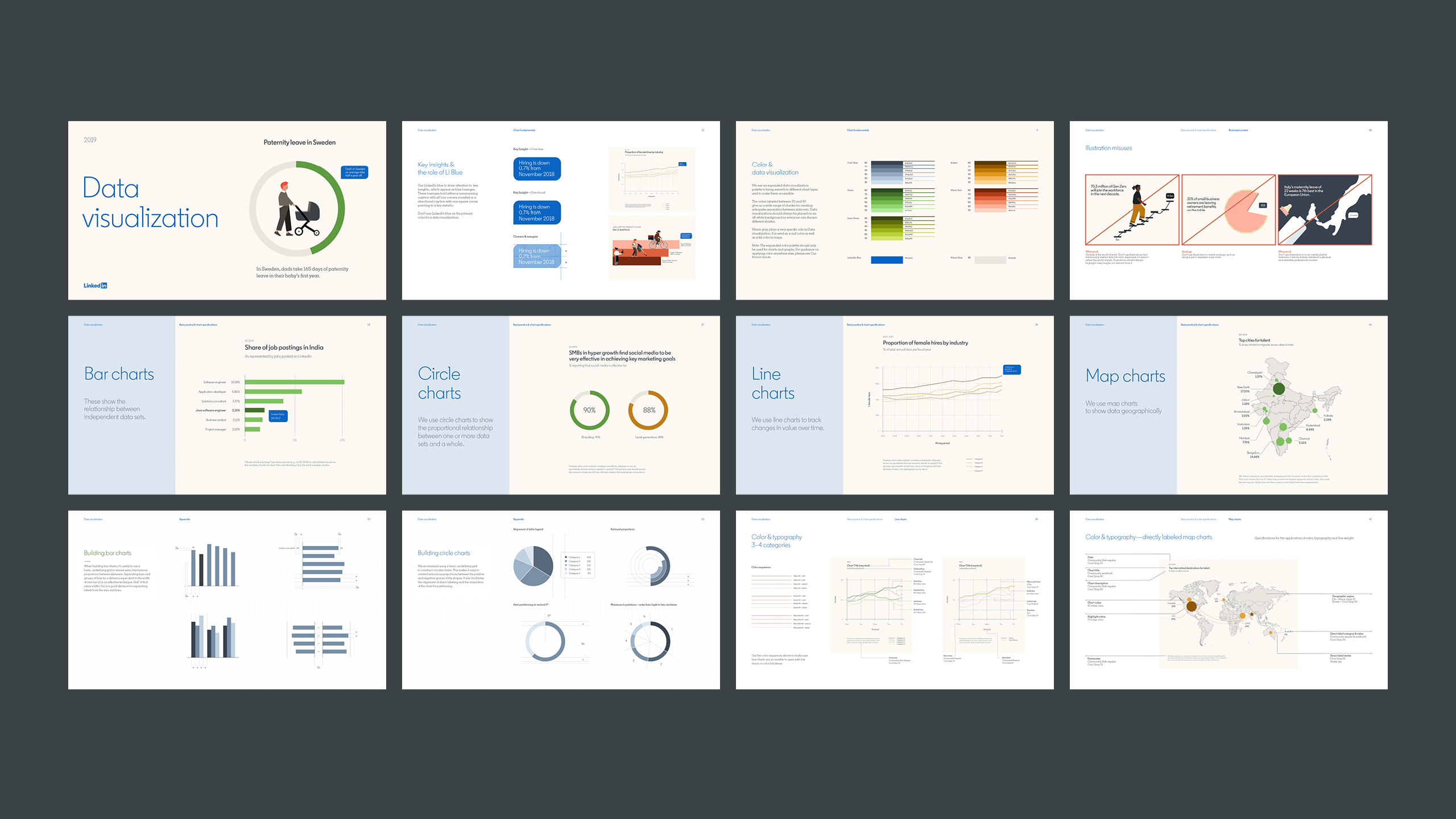
Data-driven Storytelling
Providing economic insights that help people in their pursuit of opportunity is LinkedIn's most valuable offer. Therefore, it was crucial that the brand could express these insights through data-driven storytelling in a way that feels compelling and human. Working closely with the head of product design, we co-created a robust approach to data visualization that activated all of the expressive elements of the vsiual identity, while meeting all of the performance and accessiblity standards required for digital and product integration.
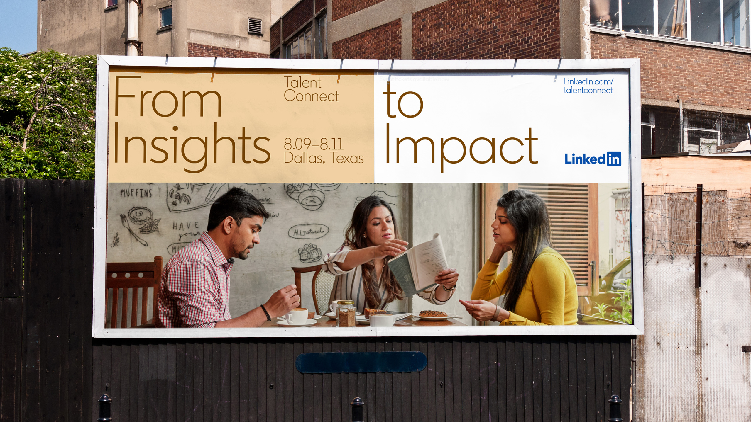
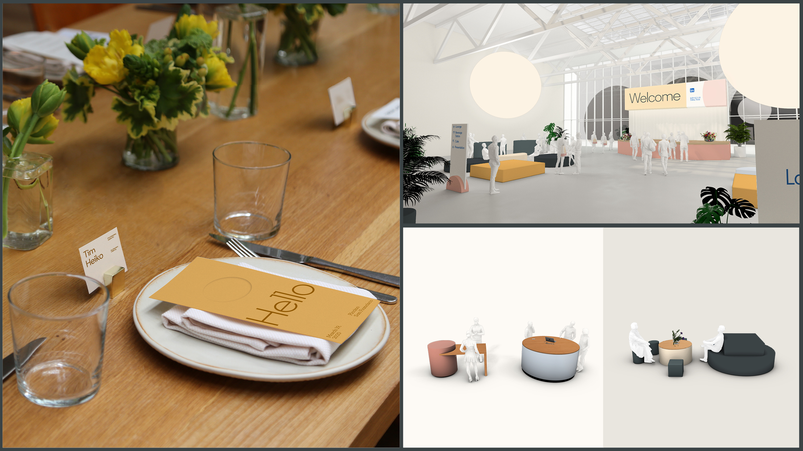
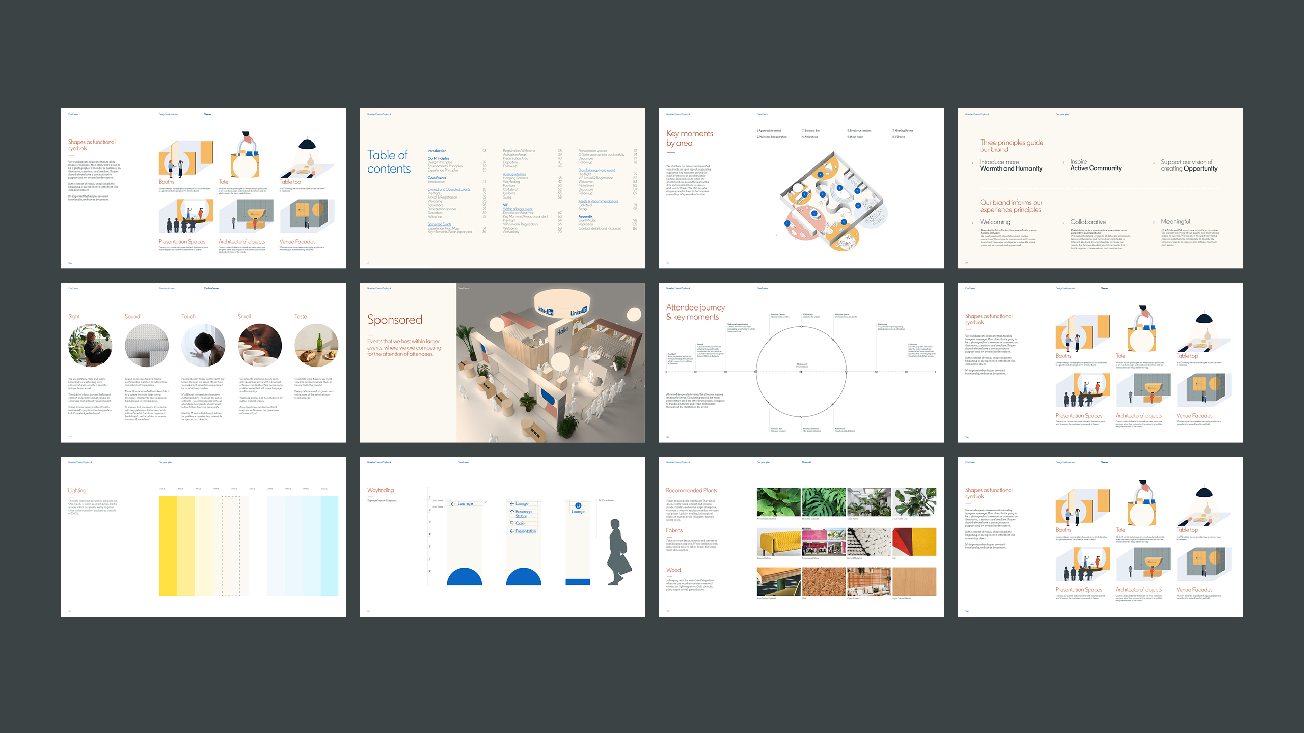
Branded Events
We also developed a strategic playbook for branded events, providing rigorous detail for structuring the experience journey for attendees, including art direction guidance for lighting, furniture, wayfinding and print materials.
Equipping a Global Business
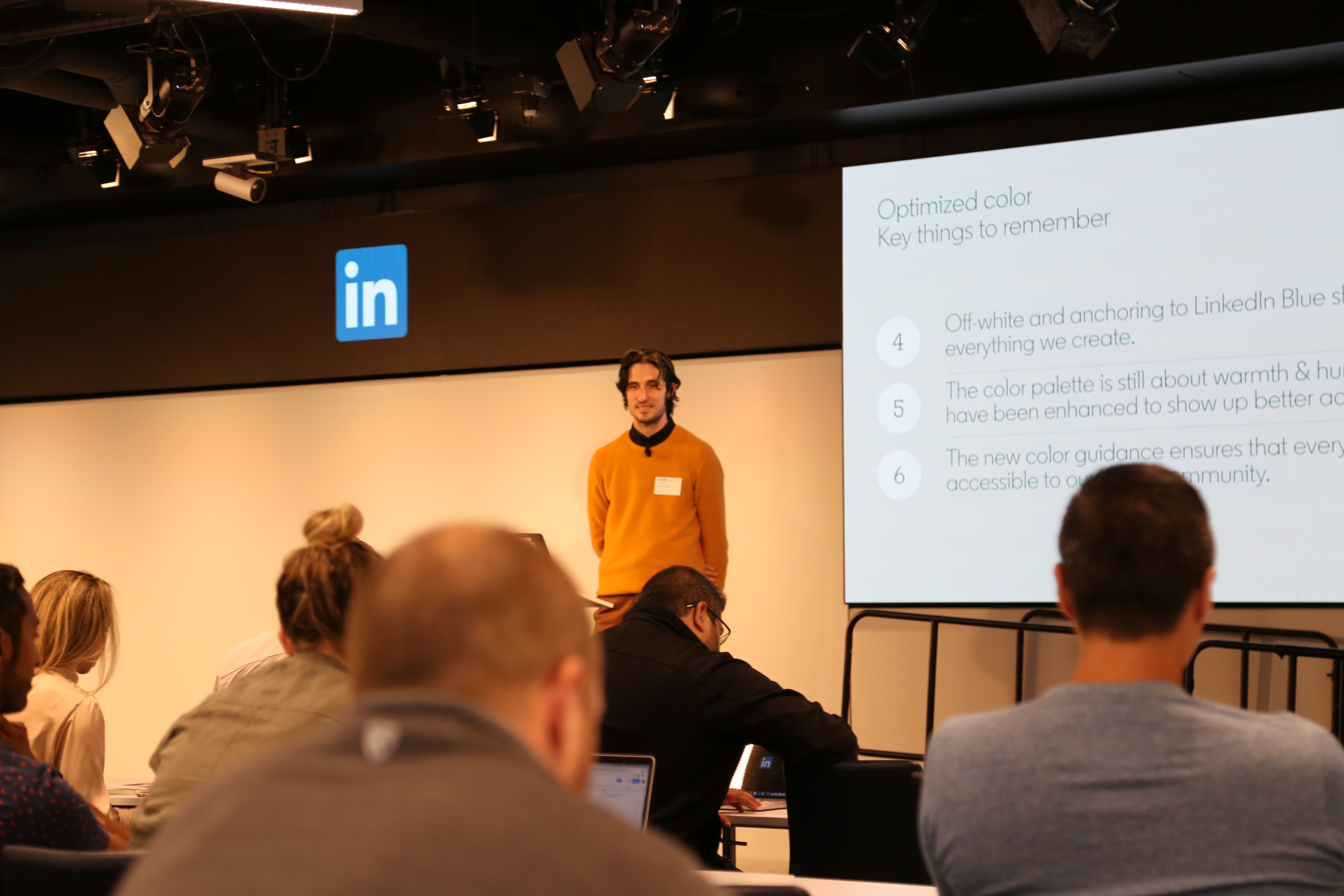
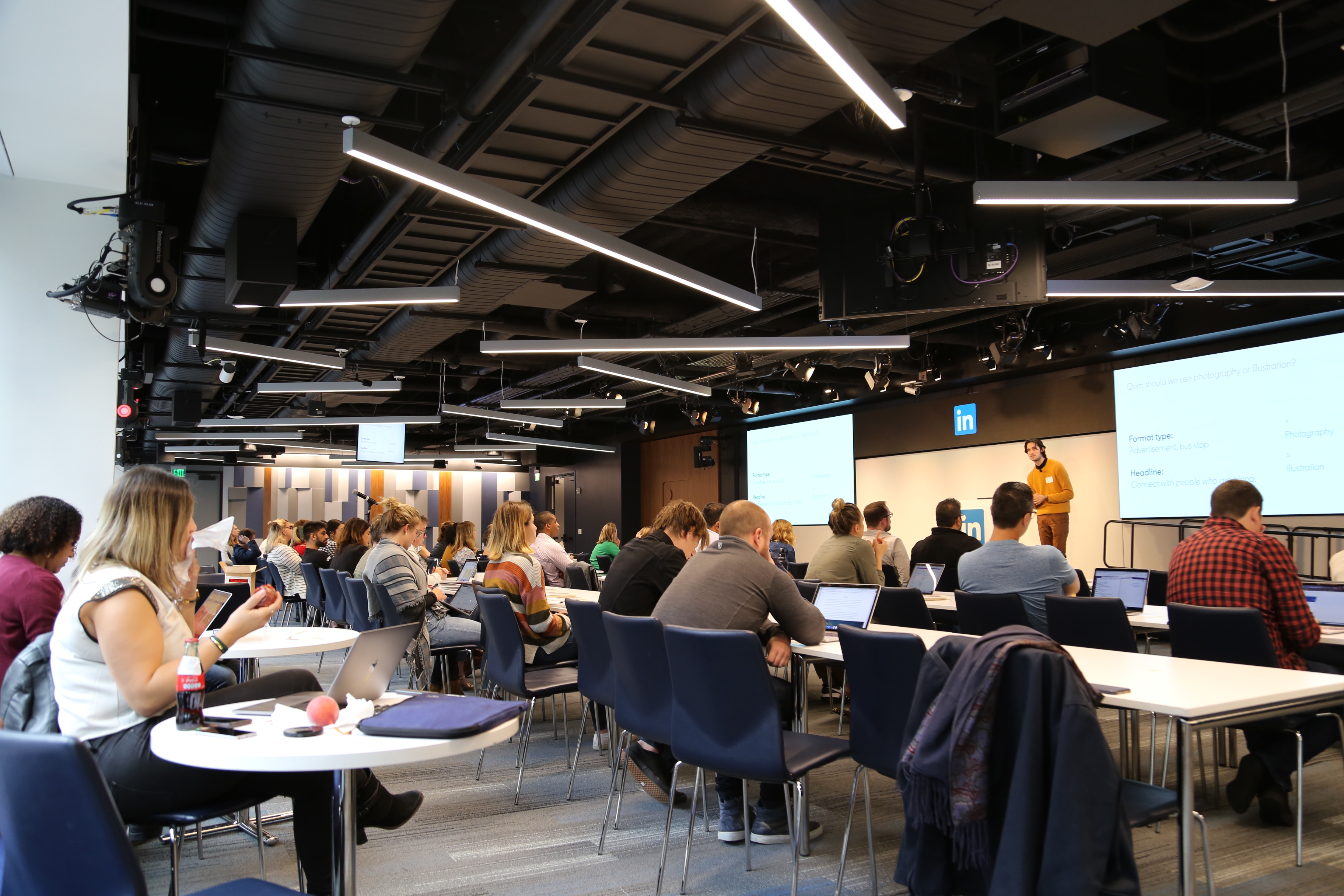
The near 12-month engagement with LInkedIn culminated in Brand Week during the summer of 2019. I was invited to their headquarters in San Francisco's finanical district, where over a period of 5 days I conducted brand training seminars with teams spanning marketing and product. The sessions were fully interactive, integrating pop quizees and Q+A sessions into the presentation. The positive response and enthusiasm for the new identity was truly heartwarming.
Copyright © Jaymes Moore 2011–2020