State Farm
statefarm.com
NYC
2019–2020
Visual Identity
Verbal Idetnity
Sonic Identity
Custom Typeface
Motion Toolkit
Photo Library
Illustration Library
Role: Design Director
Agency: Wolff Olins NY & SF
Evolving an American Icon—At #34 on Fortune's 500 list, State Farm is an industry juggernaut with a rich history of triumphant milestones that have transformed their business in the midst of adversity. In 2019, State Farm approached our team at Wolff Olins with another watershed moment in their history. In an industry driven by advertising gimmicks and mascots, State Farm needed a breakthrough brand identity system that would allow them to leverage their rich heritage as the Good Neighbor brand in order to excite new audiences about their futures and the role that State Farm products can play in achieving their dreams.
A special thanks to the amazing creative partners we worked with on this project:
Typography: Displaay Foundry
Illustration: Laura Alejo
Photography: Michael O'Neil
Sonic Idenity: CMOORE Sound
Oval System
Through steadfast comittment and investment, State Farm has immensly deserved equity in their three-oval symbol. By breaking the oval free of it's containing mark, we transformed this most iconic asset into a dynamic storytelling device.
Coupled with the propiretary studio photography style we developed, the oval functions in two different compositional modes. From a profile perspective, the oval provides a portal into an ideal future achievable through State Farm products and services.
From an isometric perspective, ovals become stages for neighborhood scenes. This allows the Good Neighbor persona to take on a larger-than-life meaning, effortlessly scaling from intimate scenes to expansive neighborhoods, revealing interactions between communities and State Farm agents and illustrating otherwise complex product bundling scenarios.
Oval Gestures & Motion Toolkit
The oval was further evolved into an expressive gestural language, bringing the human feel of State Farm agents to automated digital experiences.
Oval-inspired Typography
Working with Displaay Foundry, we crafted the Mecherle family of typefaces, named after the founder of State Farm. The alphabet poettically integrates the oval into the tiddles and counterforms, creating a word-image that is truly unique to State Farm and allowing for a branded presence in even the deepest authenticated spaces.
Oval-inspired Iconography
Derived directly from the typeface, iconography is inter-woven with the same oval characteristics.
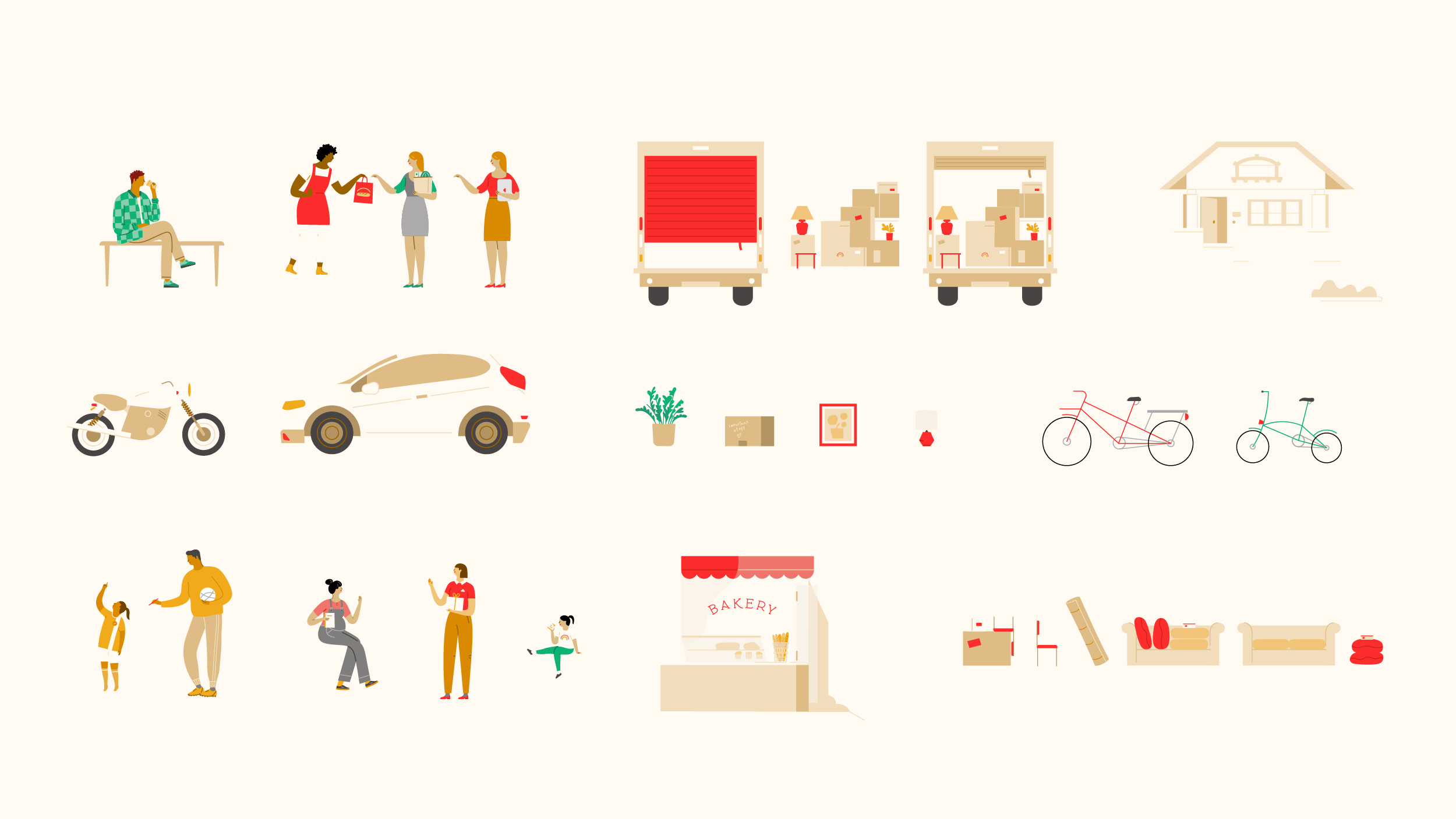
Illustration System
Illustration was a critical component of the brand's expression, allowing State Farm to more easily speak to complex topics like life insurance and abstract, intangible product features. As opposed to a static illustration library, we worked with Laura Alejo to devise a systematic approach to illustration with rigously defined stylistic components, able to be continuously expanded upon over time.
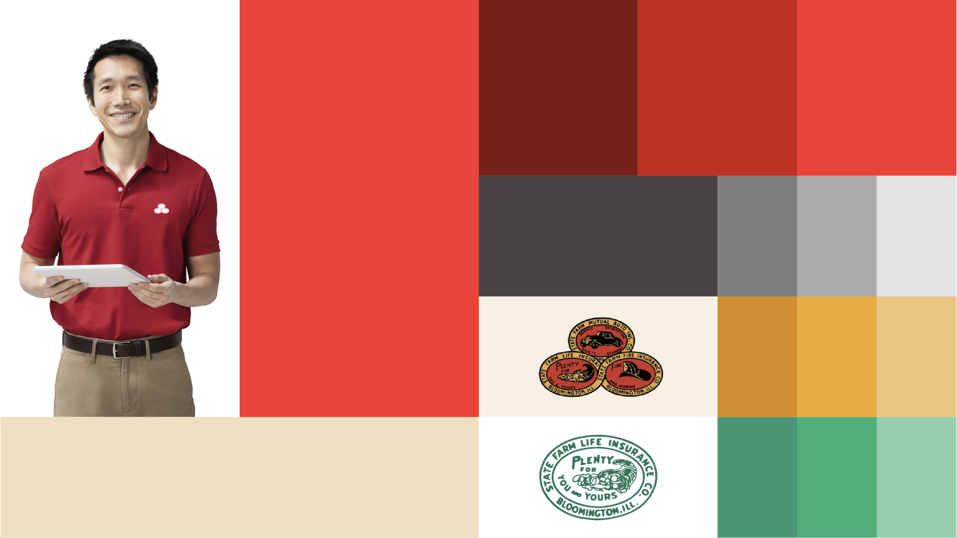
Heritage-inspired Color System
In additon to ovals, the other iconic element State Farm owns outright in their category is the color red, which we updated to be warmer and more vibrant. We also introduced a new signature color to the system, Khaki, which brough a neighborly sense of levity and approachability to the brand expression. Additionally, tertiary hues were also crafted for UX and illustration purposes, which drew directly from their rich historical heraldry.
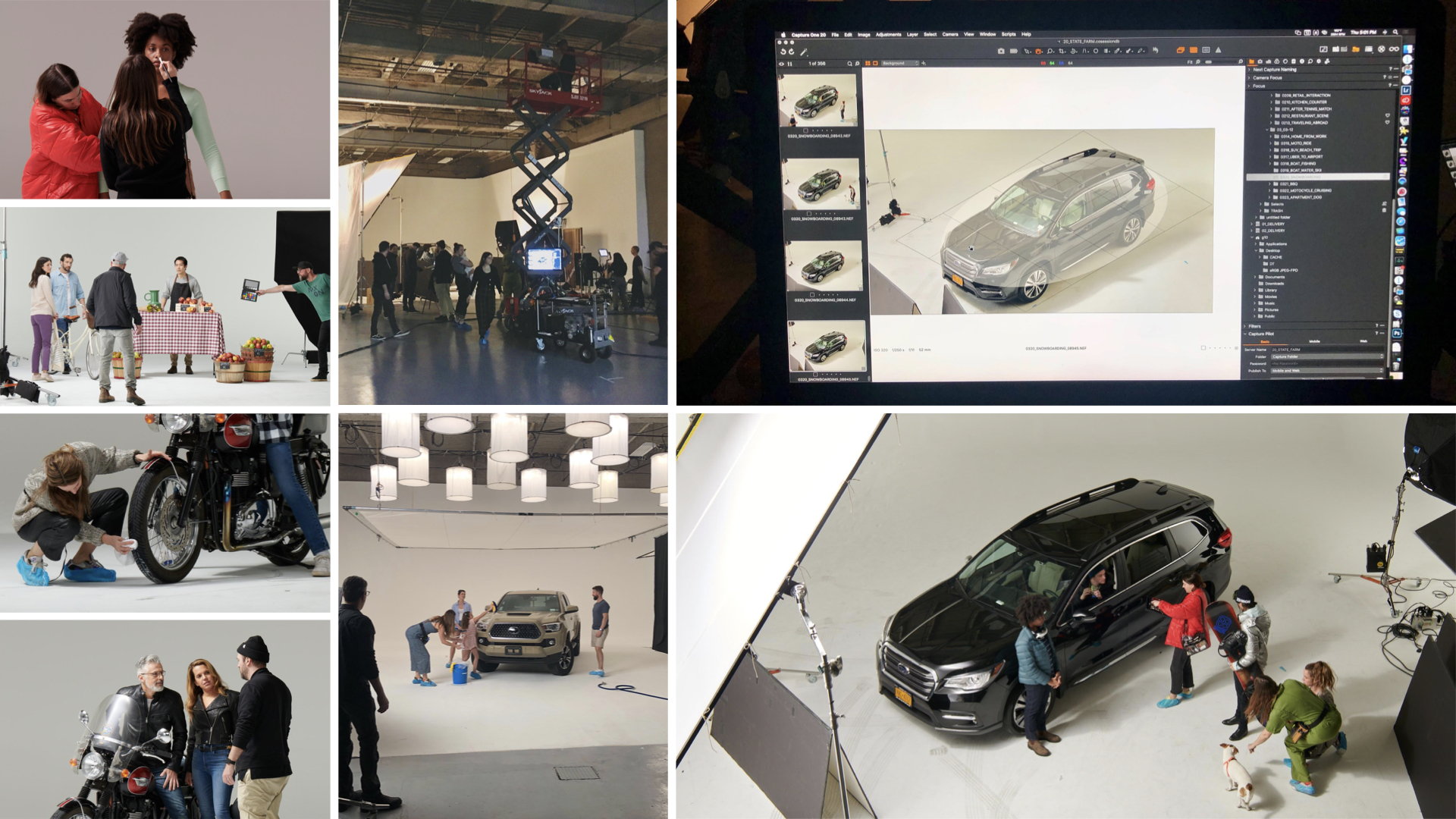
Photography Style & Library
In a category dominated by 'slice of life' stock photography, it was imperative as the leader that State Farm had an ownable and recognizeable photographic style. Working with photographer Michael O'Neal and his team, we developed a unique approach to studio photography that seamlessly blends the reality of everyday life with the clean idealism of the studio space. As part of a 5 day shoot, we captured an immense range of relatable product moments, from small business scenes and agent interactions to towering isometric shots of vehicles captured from high above a cherry picker.
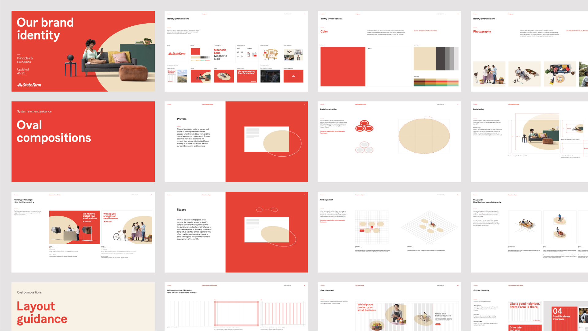
Guidelines & Training
To ensure the system could be effectively rolled out across an organizaiton of more than 60,000, richly detailed and self-reading guidelines were created. Additionally, we conducted 2 weeks of remote training sessions spanning marketing and product teams, as well as third-party agency partners.
Copyright © Jaymes Moore 2011–2020