The Bascom—A Center for the Visual Arts
USA, 2010–2011
Visual Identity System
Branding Guidelines
Art Direction
Publication Design
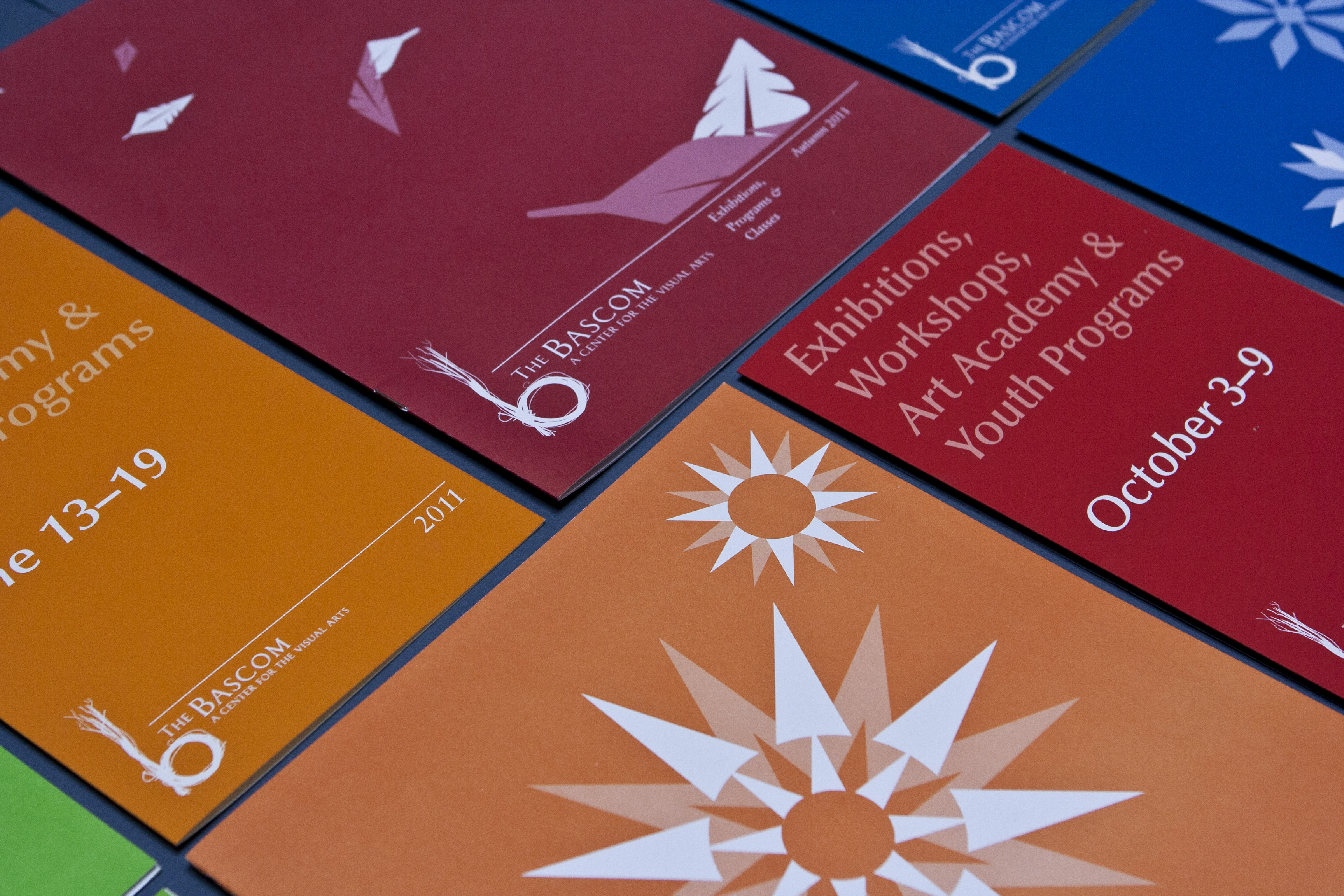
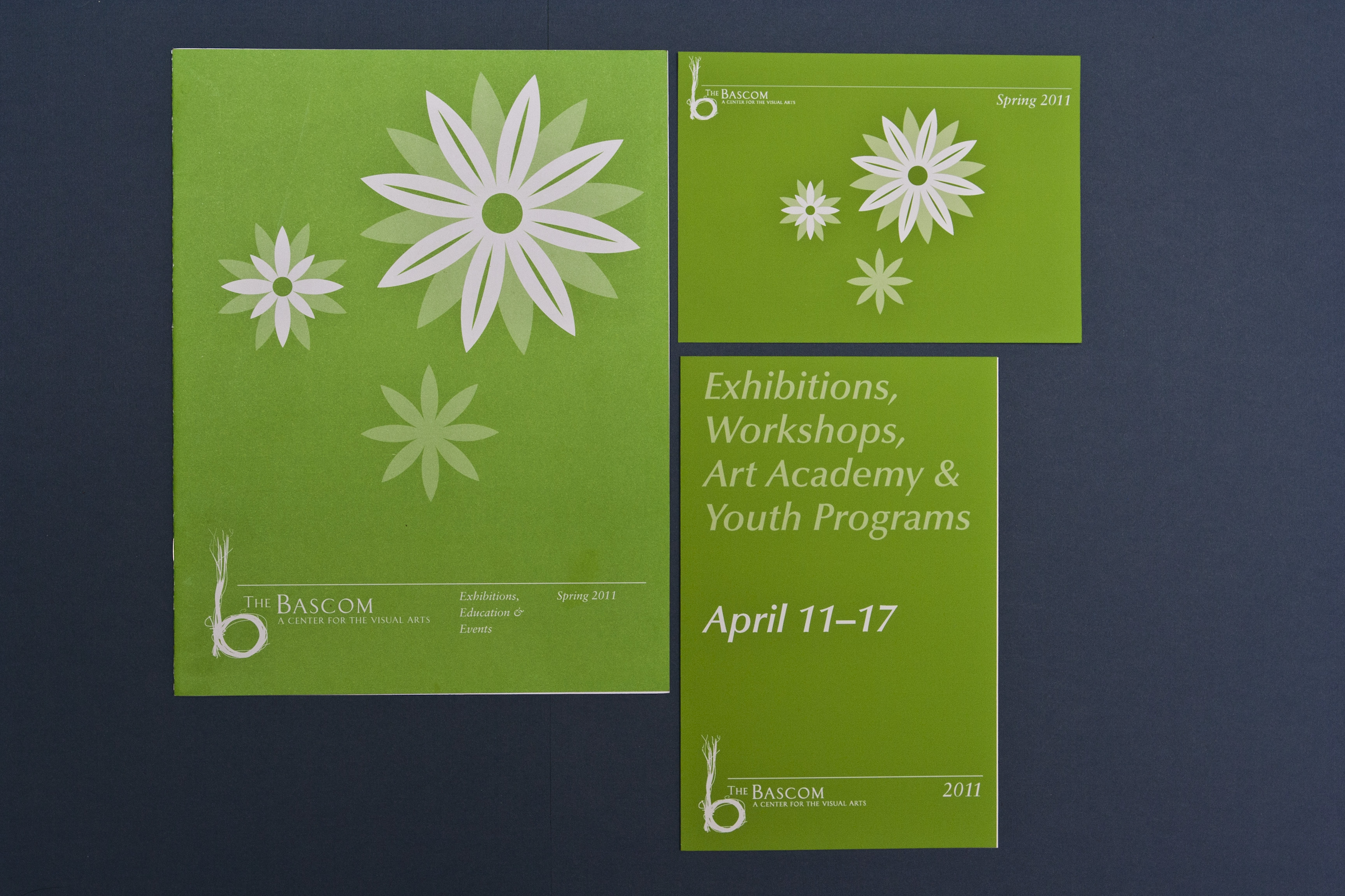
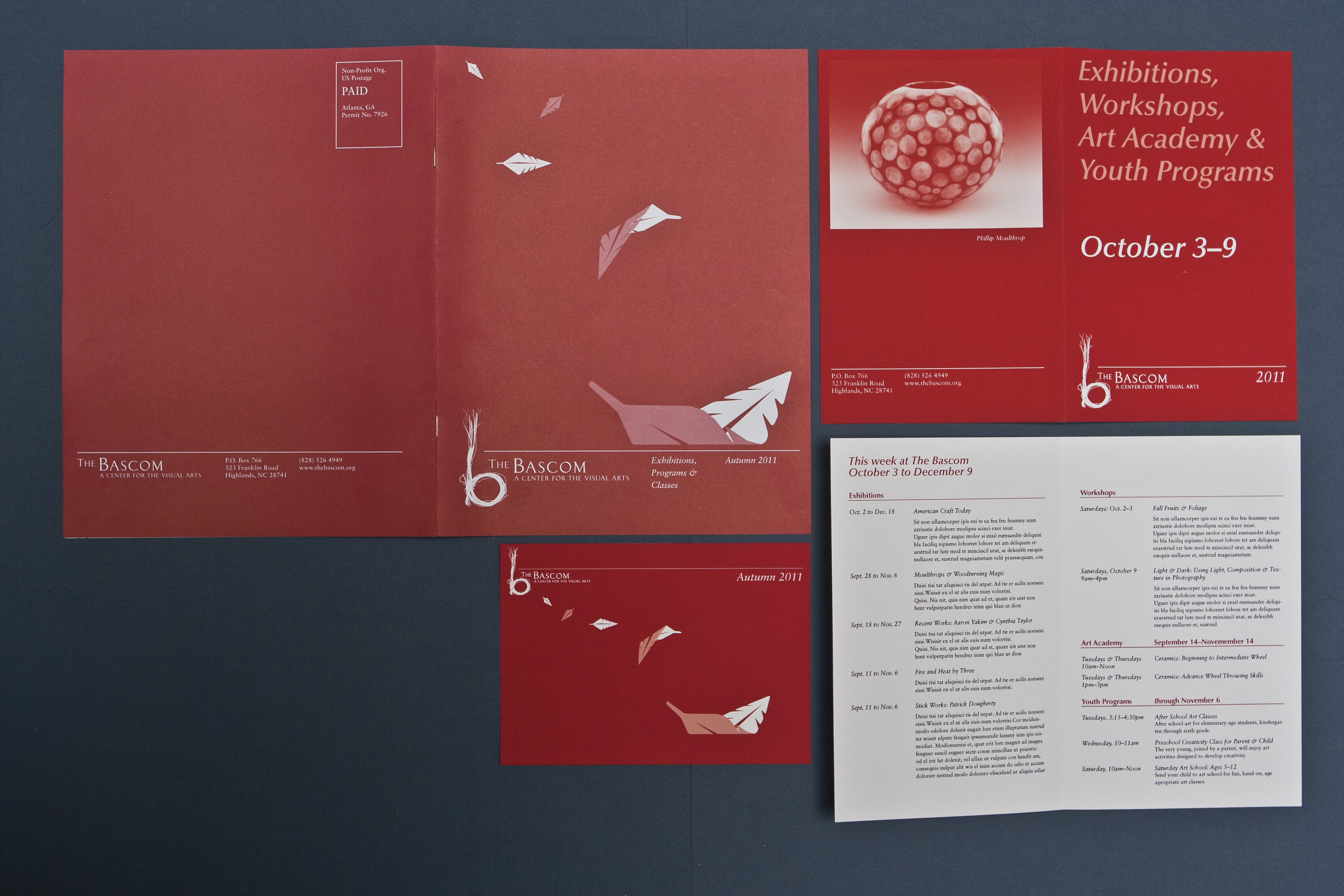
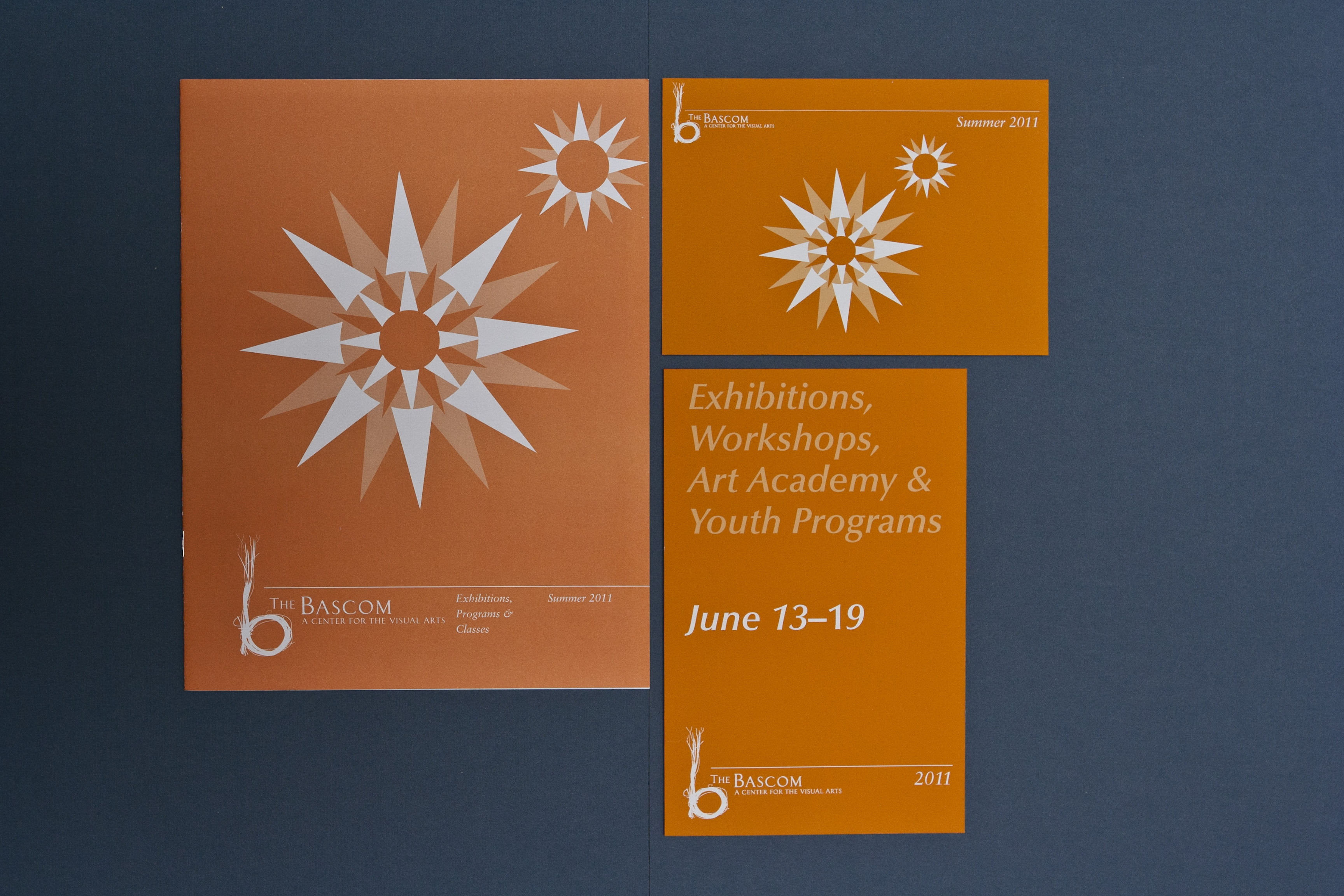
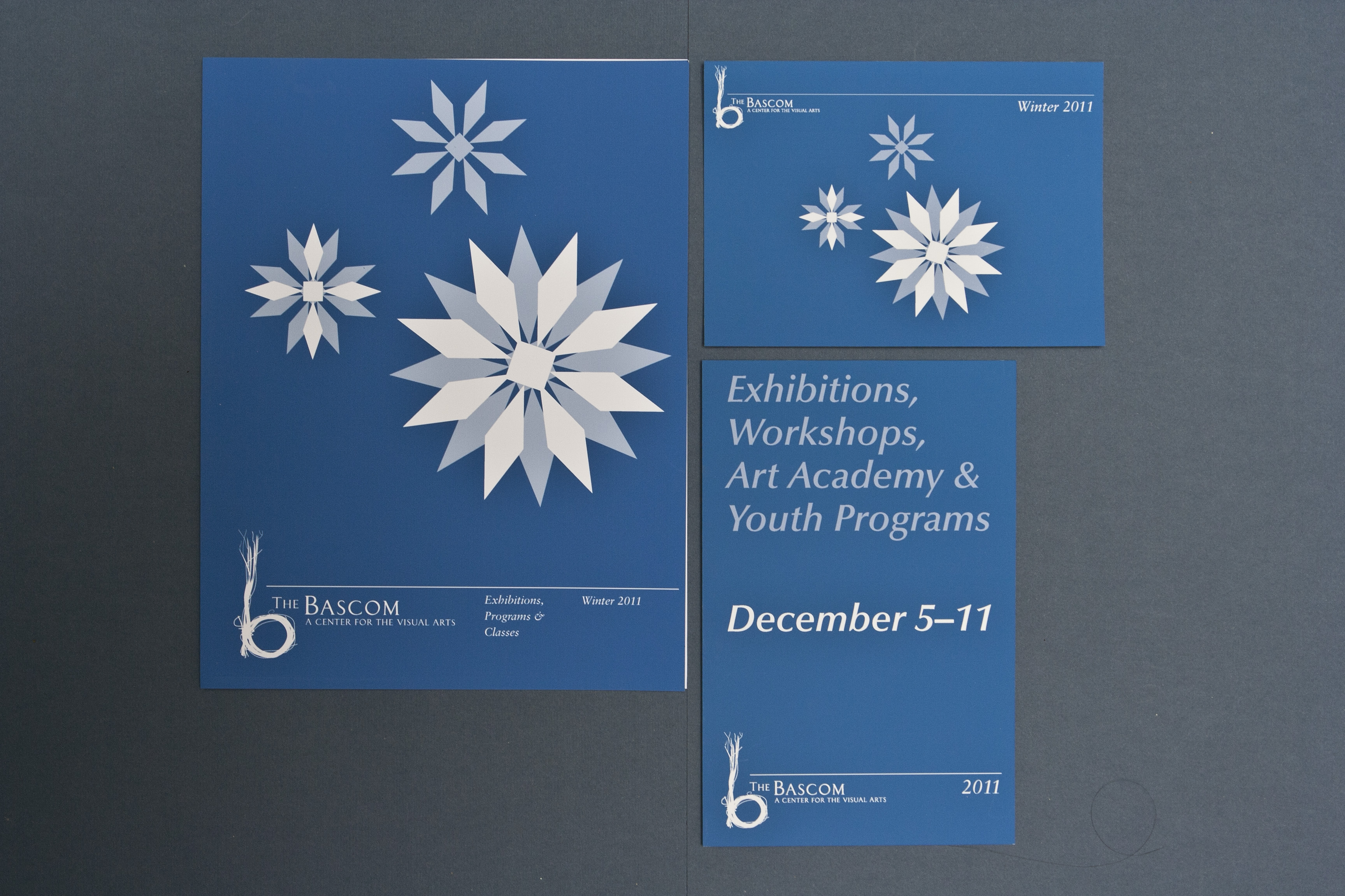
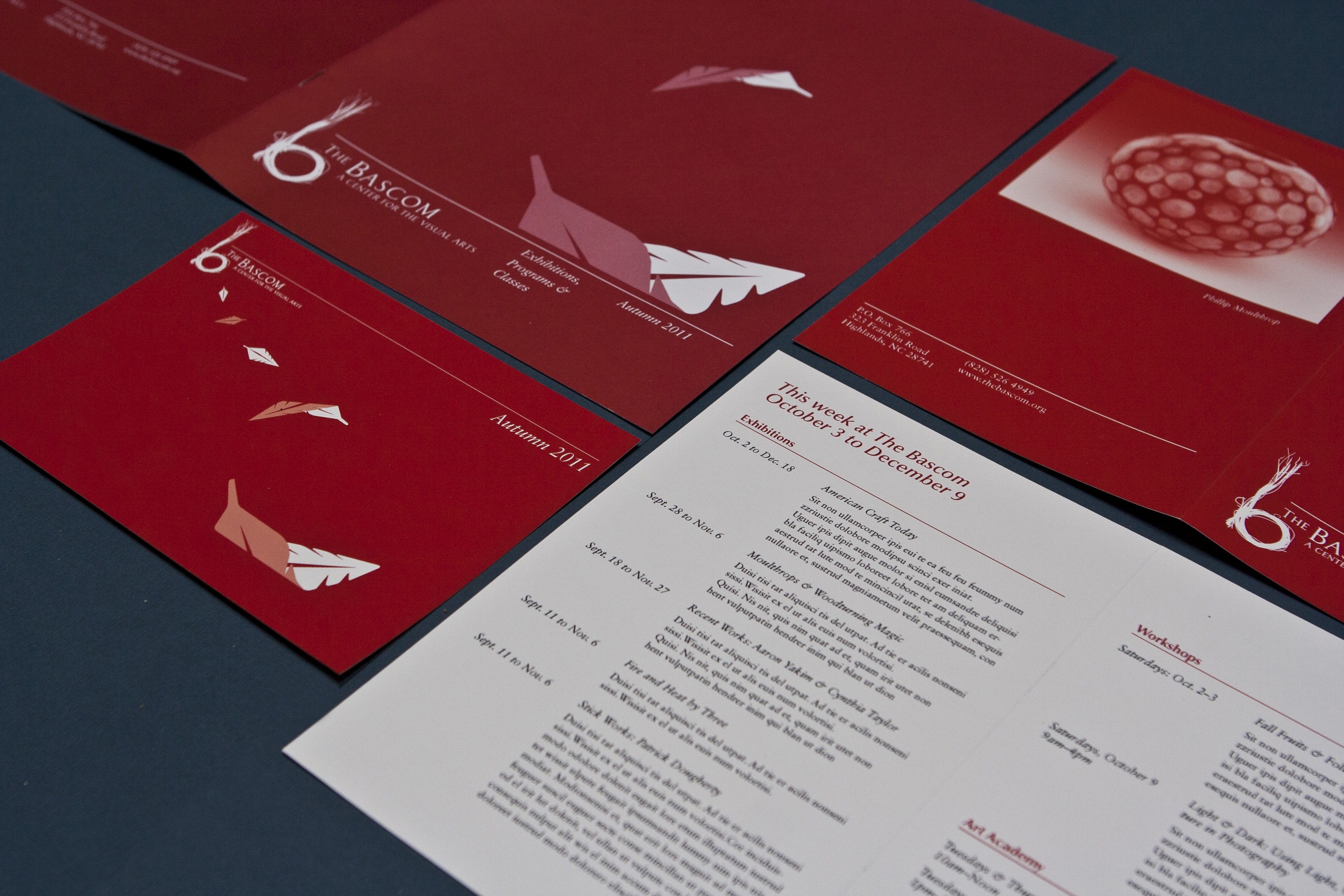
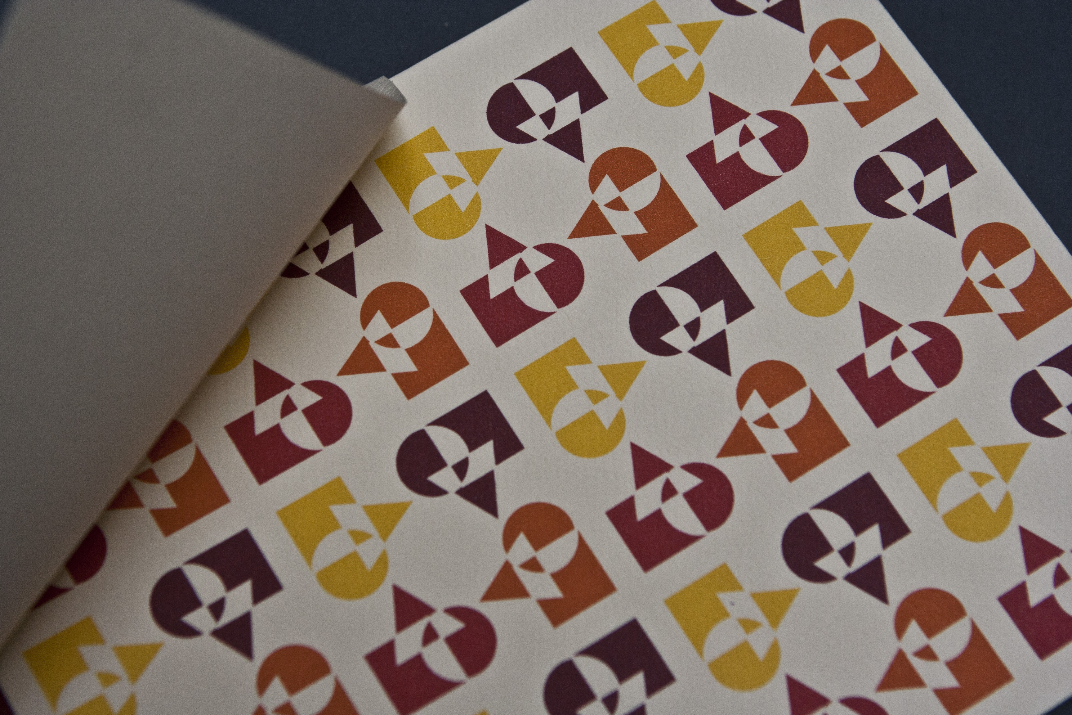
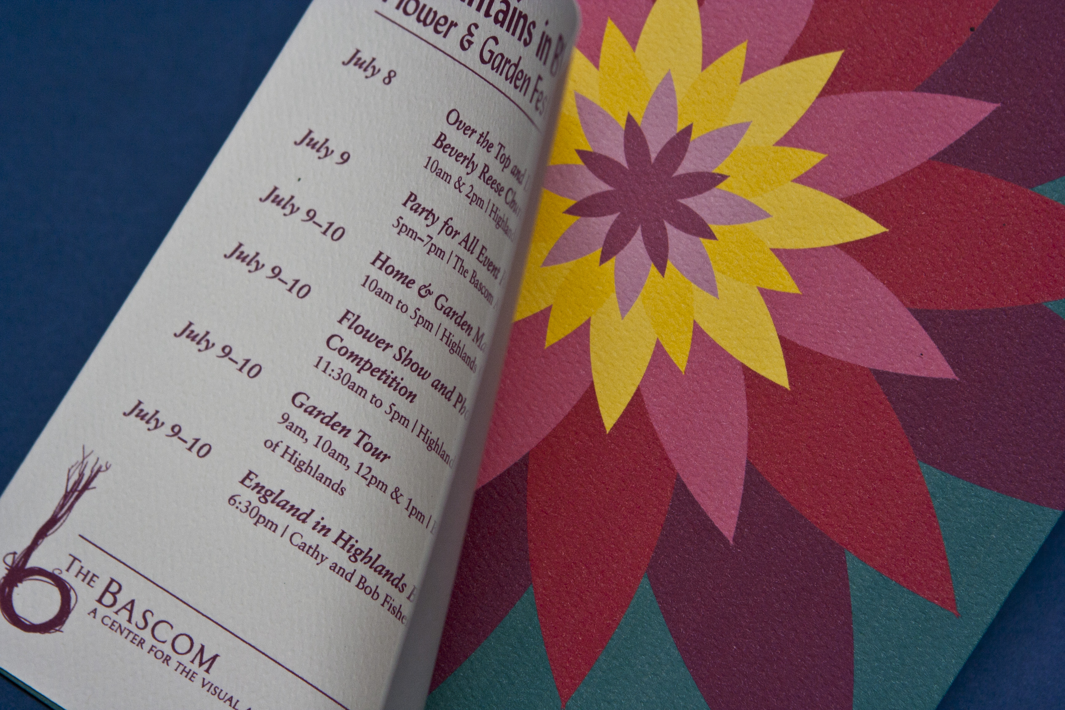
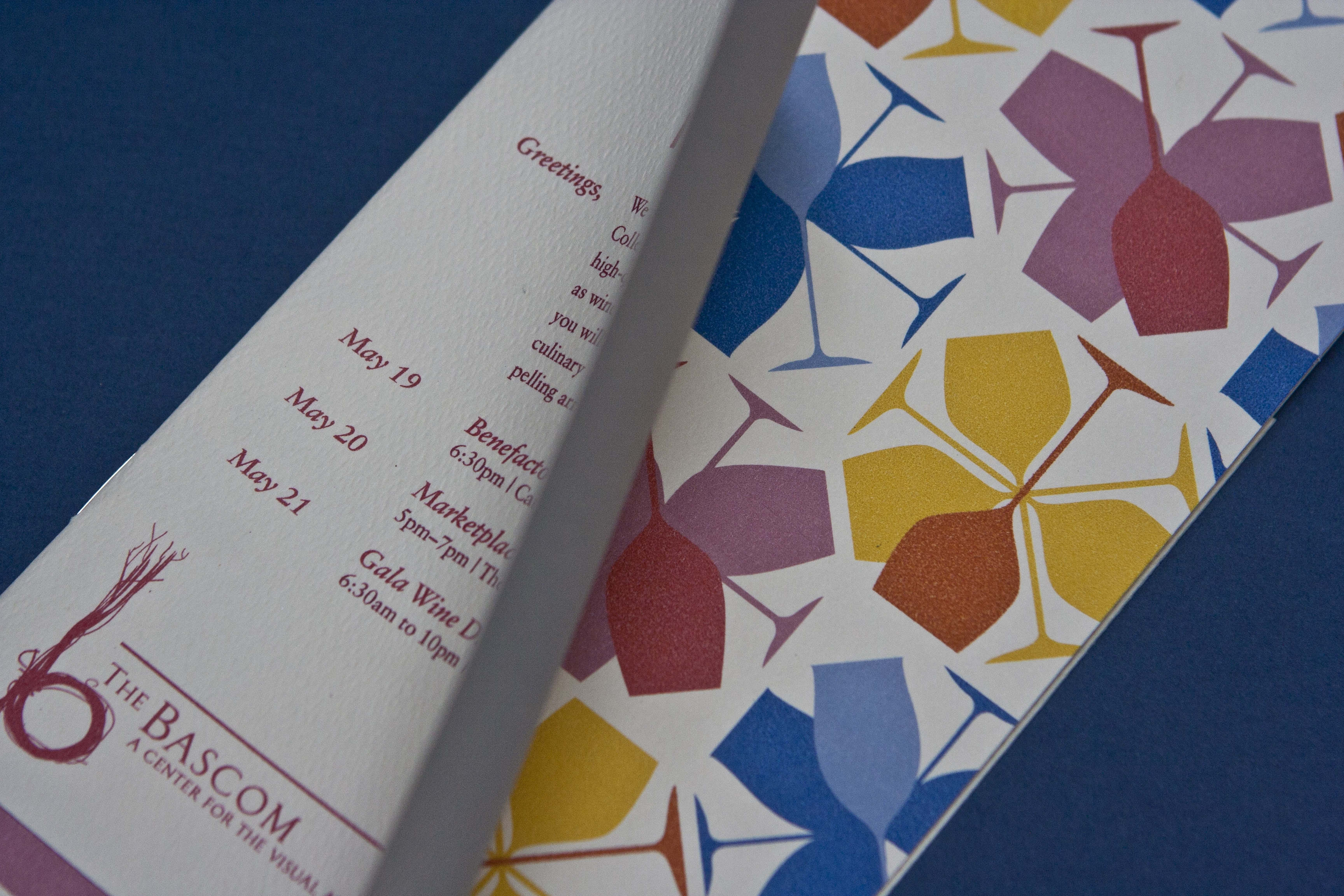
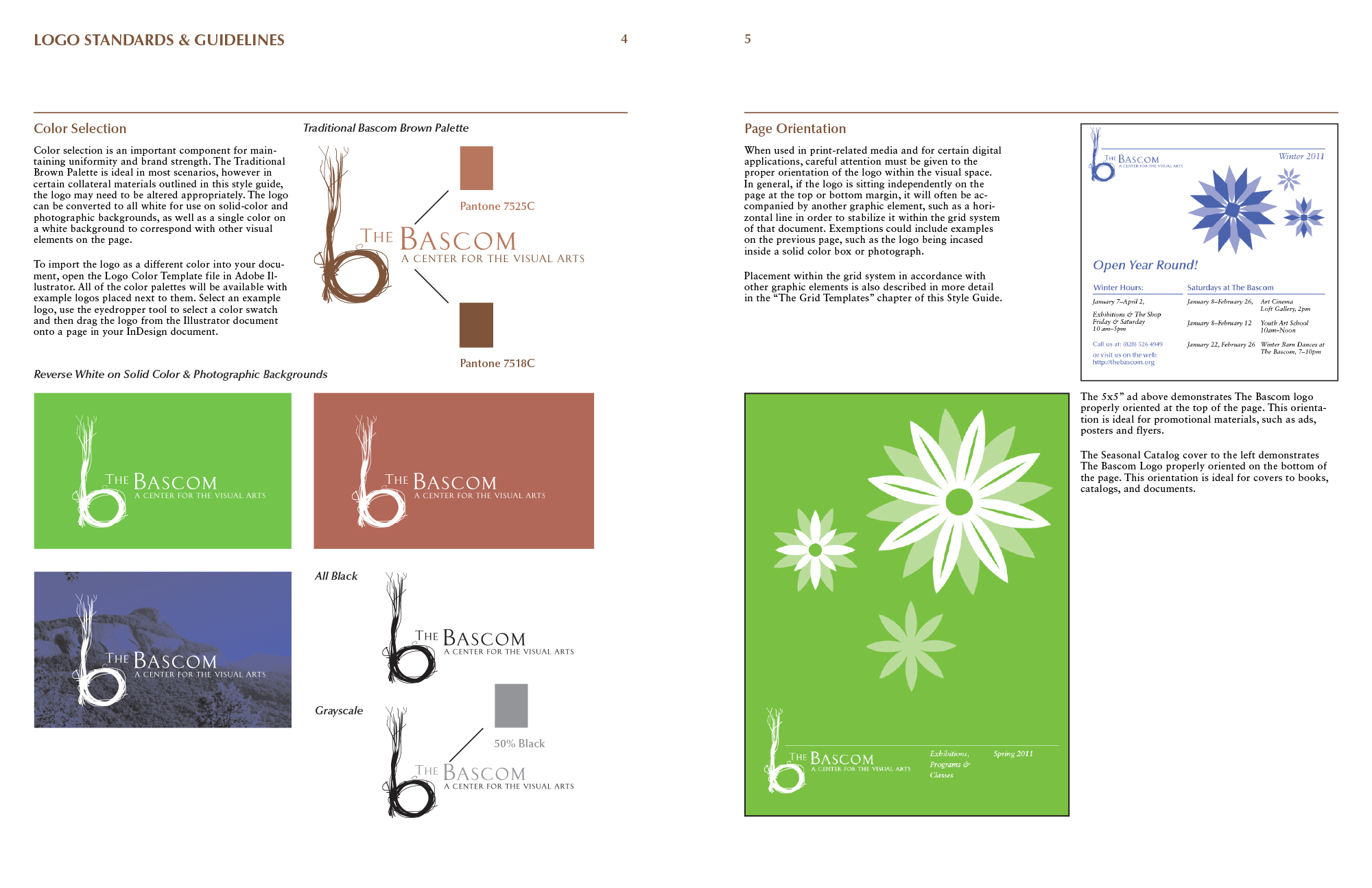
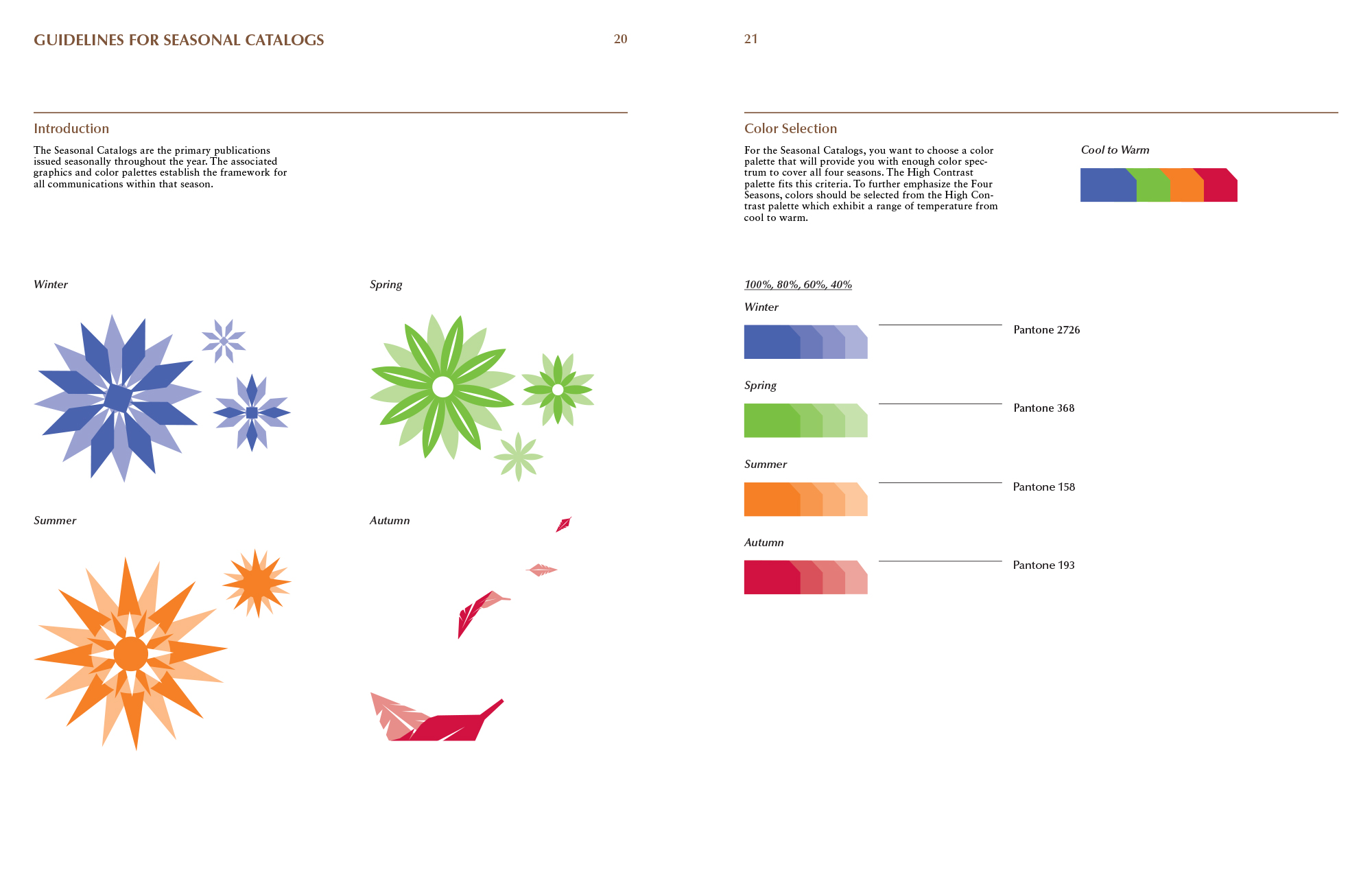
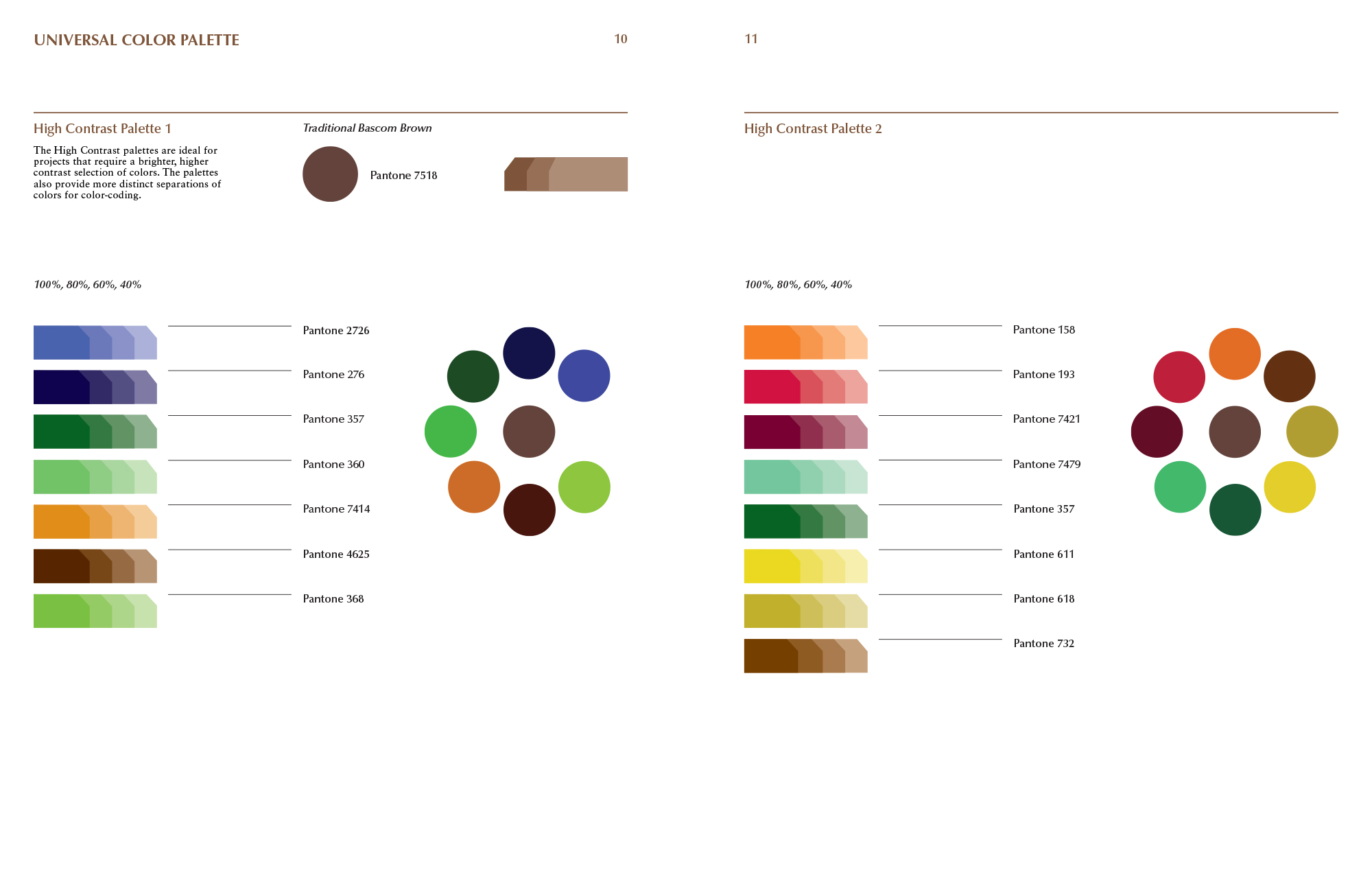
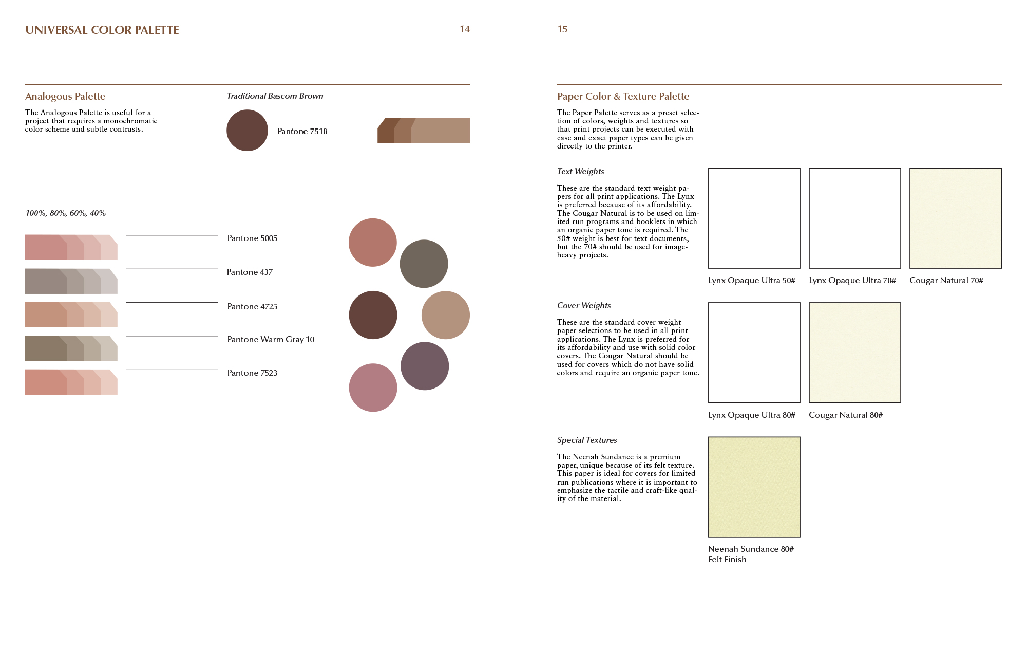
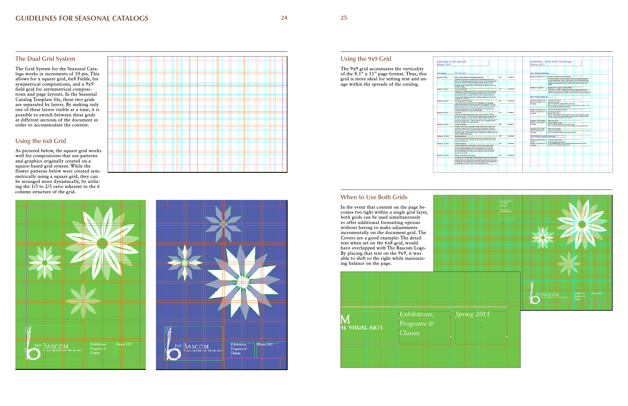
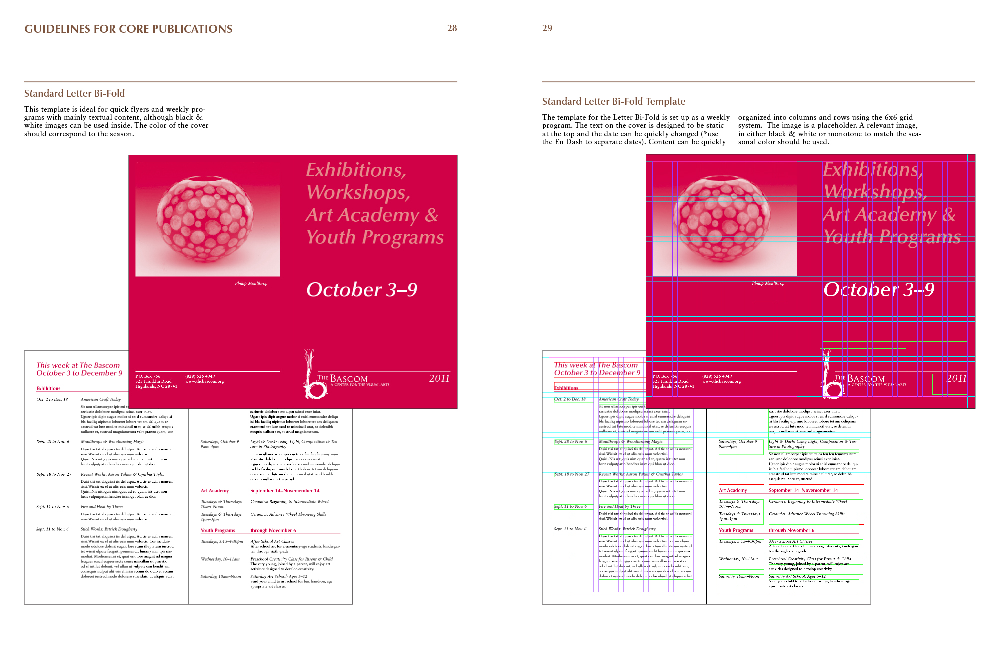
The Bascom is a 27,500 sq. ft. facility in the mountains of Western North Carolina, whose green campus functions as a community center, artist residency and exhibition space. When the facility opened its doors in 2009, no branding guidelines had been put in place and all of their their communications in the first 18 months were designed with a single brown color and the dominant use of their existing 'b' logo. Faced with brand saturation and a declining engagement with their outreach efforts, I was commissioned as an outside consultant to develop a new visual strategy and to establish branding guidelines. Serving as a liaison between the in-house communications team and the board of directors, I developed a comprehensive 45 page Style Guide and seasonally-based system for color coding communication materials. New techniques for illustration, bold typography and monochromatic photography were introduced, taking the heavy lifting off of the saturated logo mark and establishing a stronger, positive association between the organization and the community.
Copyright © Jaymes Moore 2011–2020