Travel & Leisure
New York, 2021
Visual Identity
Verbal Idetnity
Motion Toolkit
Photo Library
Brand Training
Role: Associate Creative Director
Agency: Desantis Breindel
Going beyond the page to put the world on vacation—In late 2019, Wyndham Destinations acquired the prestigious T+L brand with a vision for transforming the iconic magazine into an international travel lifestyle brand. Building on their mission to put the world on vacation, T+L approached our team at Desantis Briendel to develop an expansive visual toolkit that would allow them to create a myriad of new customer experiences and travel offerings.
As Associate Creative Director, I took a hands-on leadership role in driving this project from creative development to IPO and public launch.
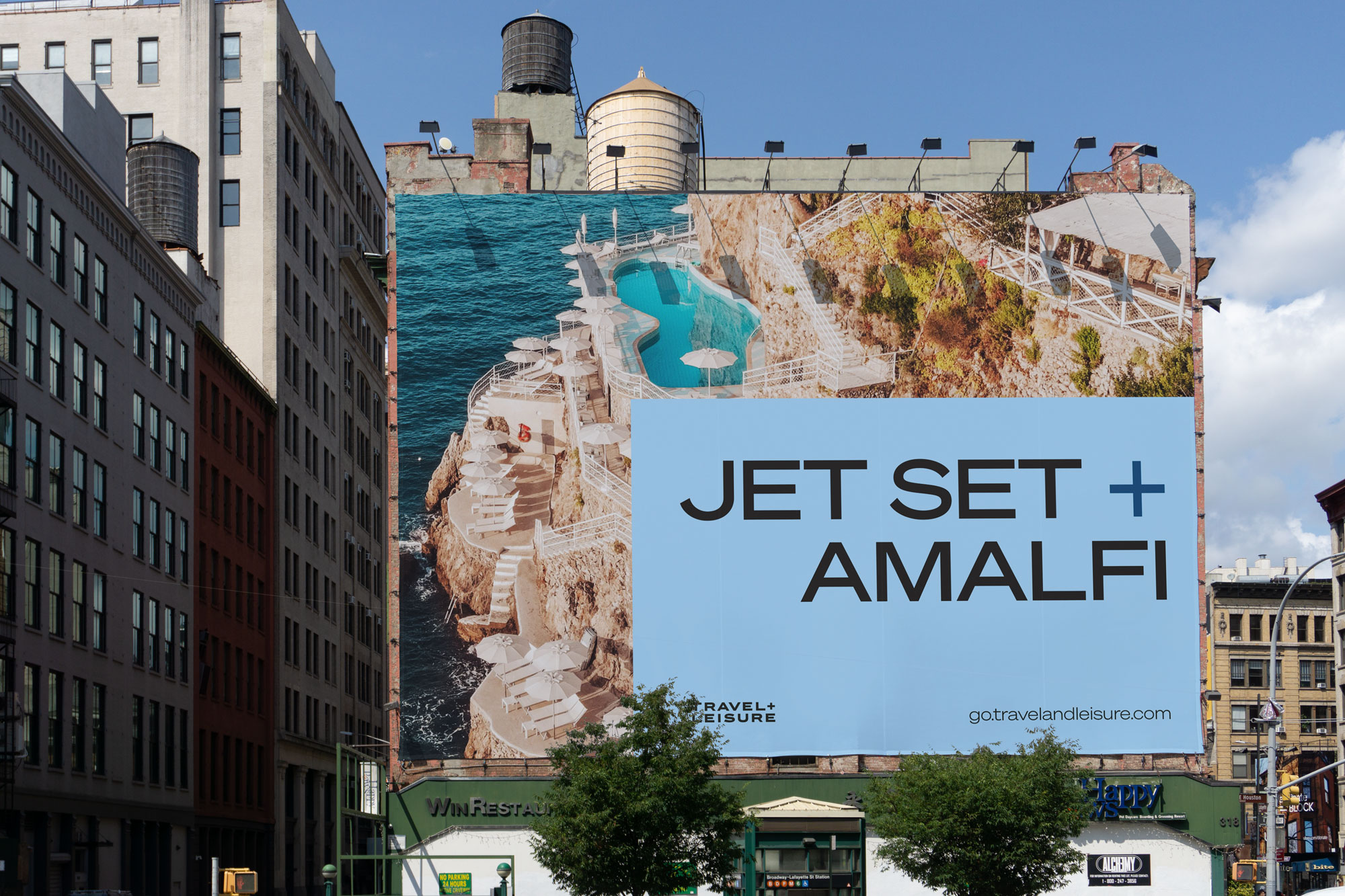
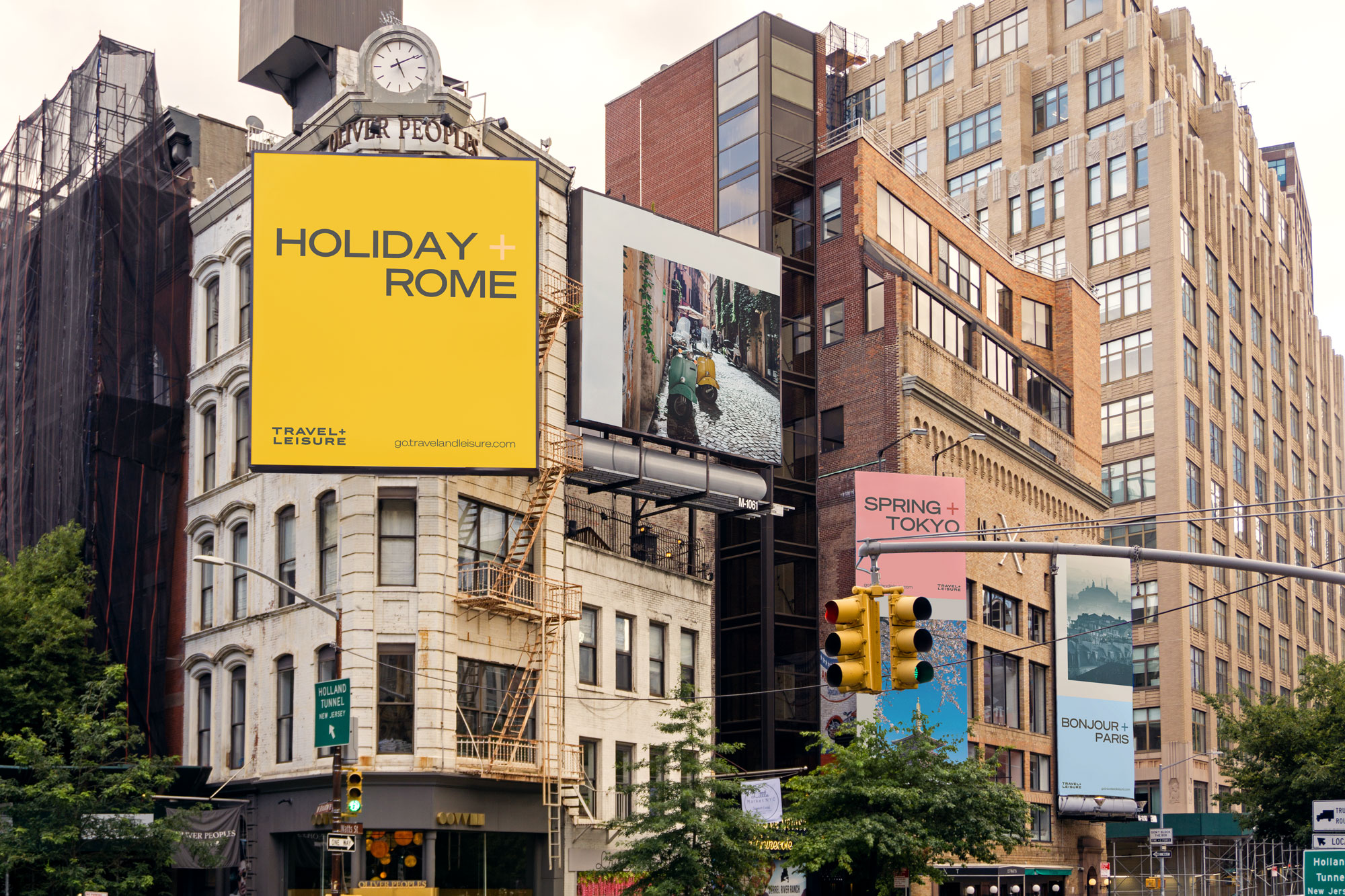
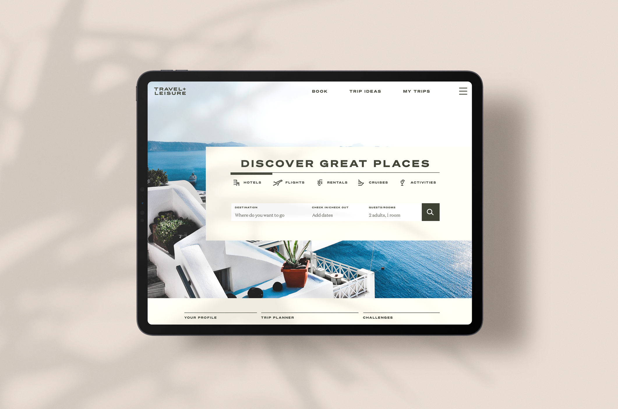
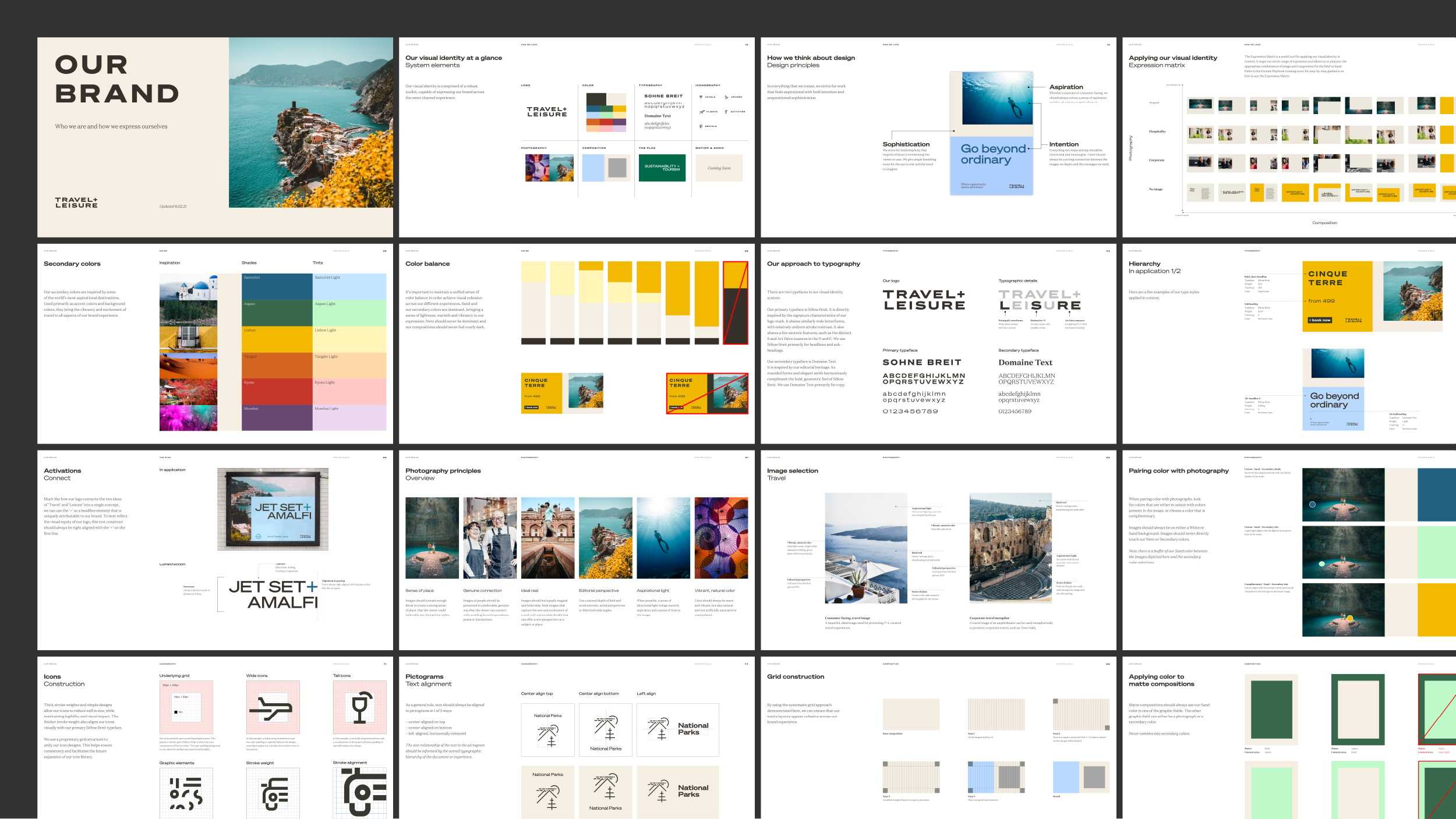
From static masthead to multifaceted toolkit
The acquisition of the Travel + Leisure brand brought with it the equity of its logo and photography. Our task was to expand this equity into a multifaceted expression system, which would transcend the zeitgeist of the magazine to all corners of the newly expanding brand experience.
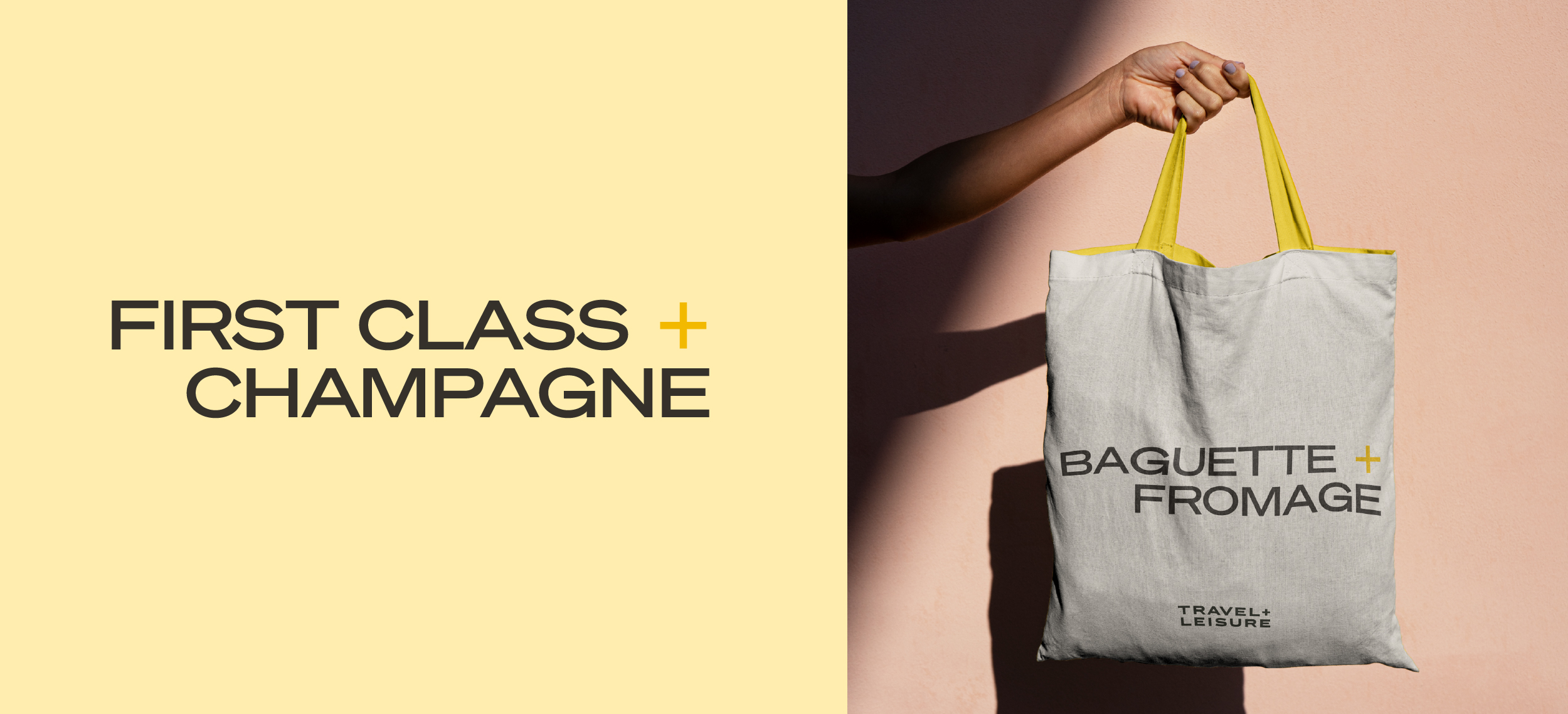
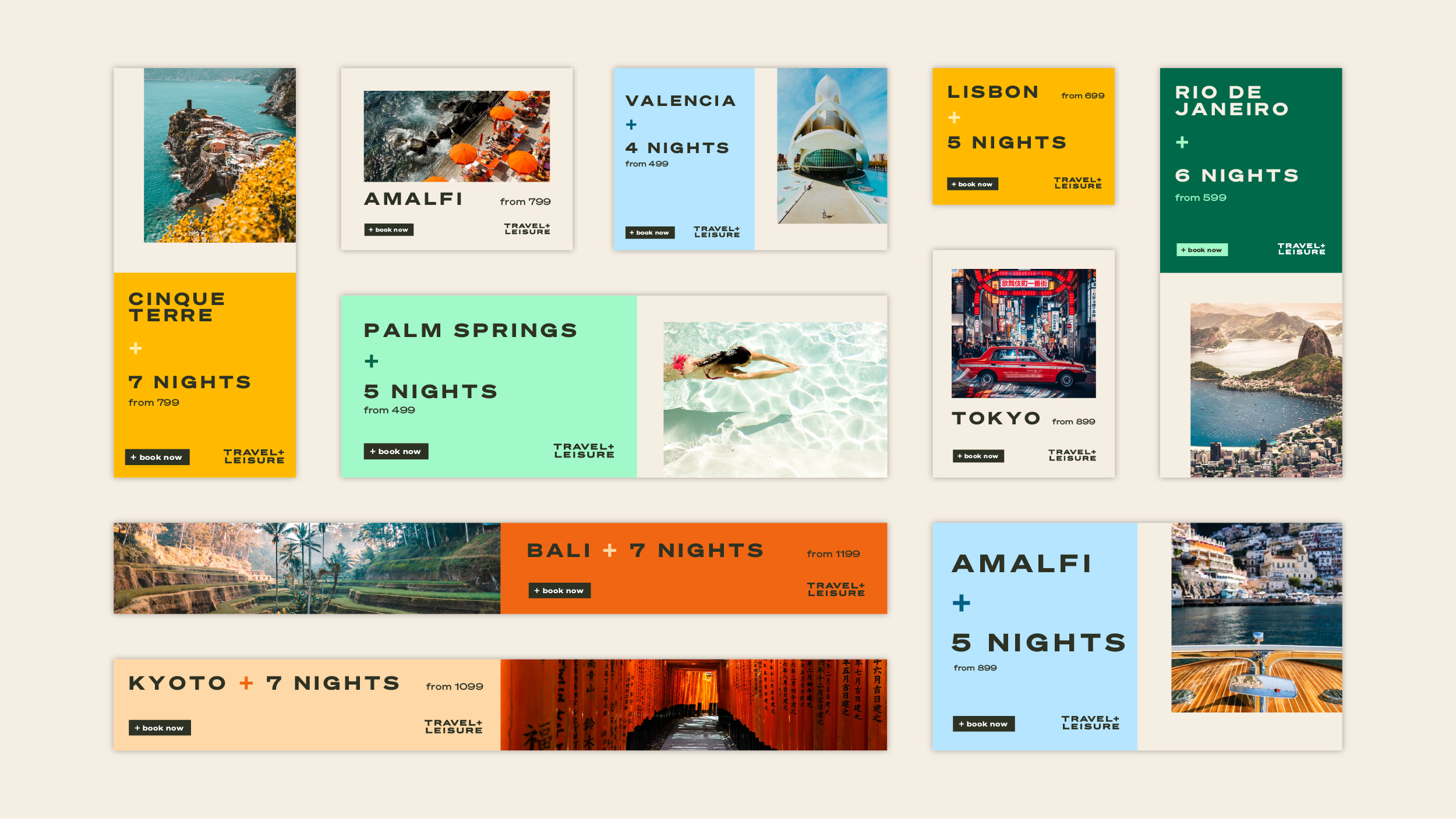
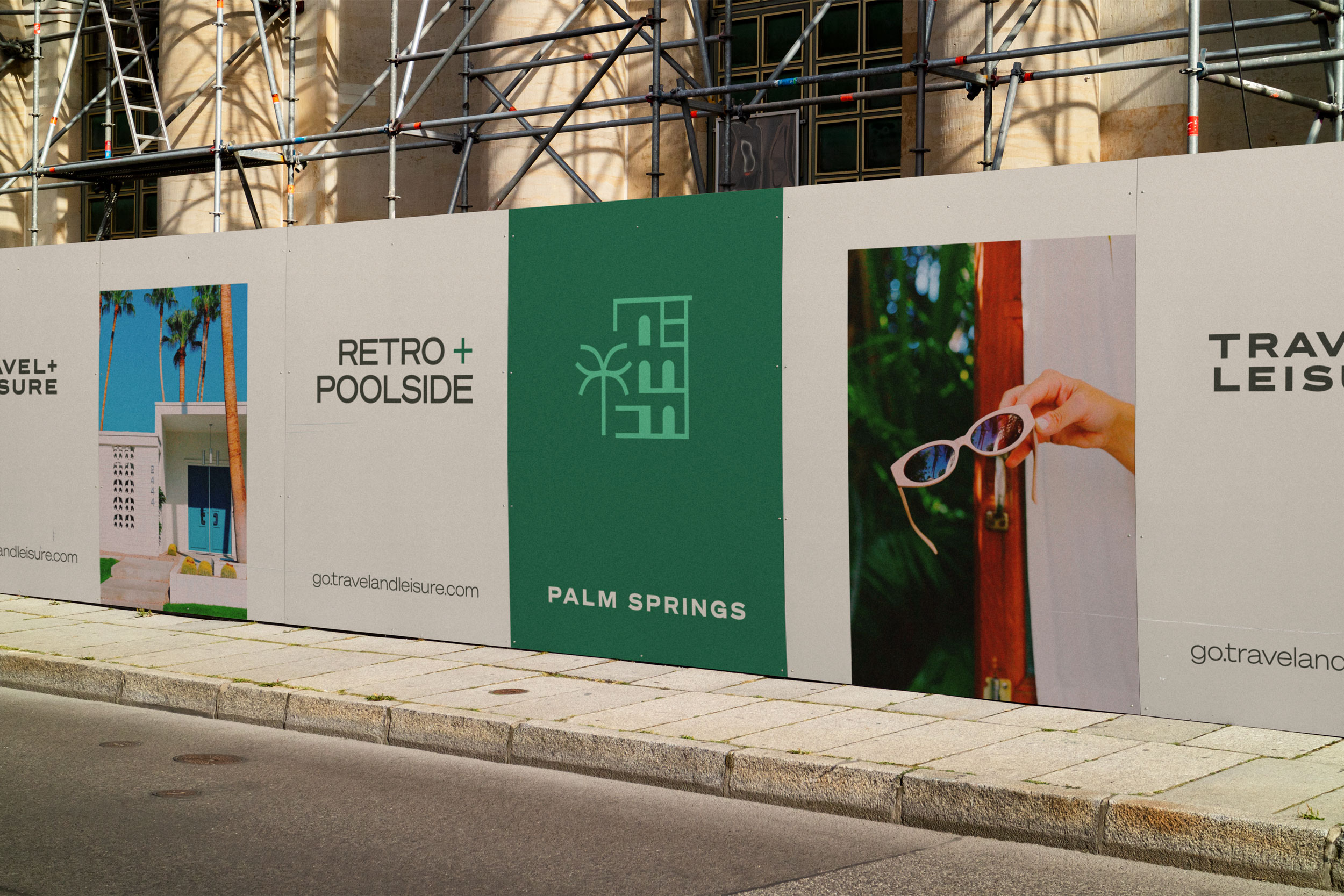
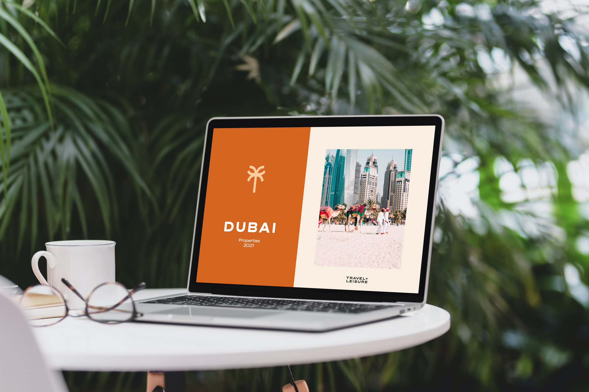
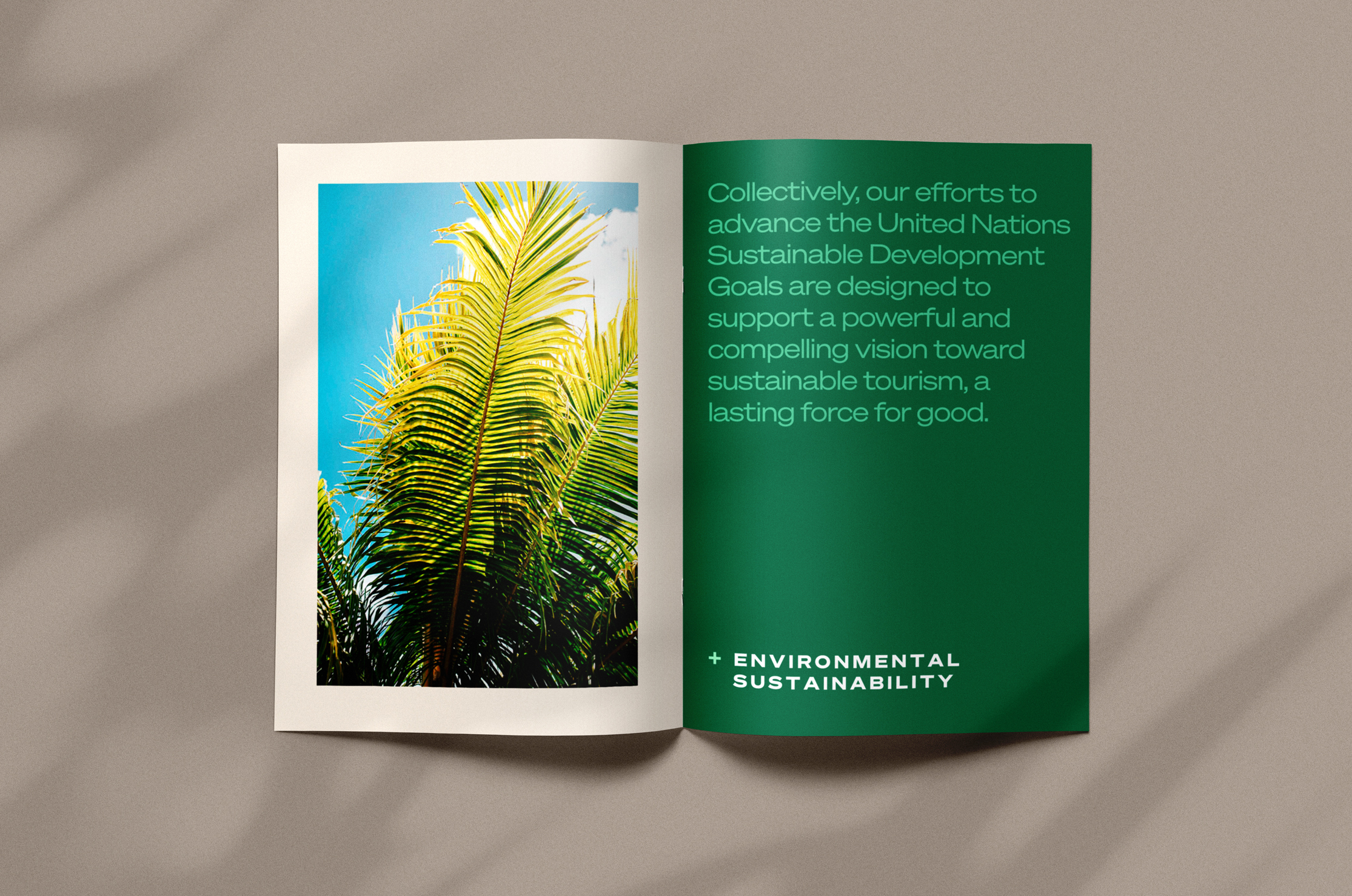
Wide, modern typography played an essential role in extending the visual equity of the logo, while an expansive color palette brought the vibrancy and excitement of travel photography to the forefront of the brand expression. The signature ‘+’ of the logo was activated to create a dynamic and powerful typographic device. The ‘+’ also inspired a composition system that connects the editorial heritage of the brand to its newly expanded offer. Collectively, these elements provide a robust toolkit, capable of expressing the brand across the omni-channel experience.
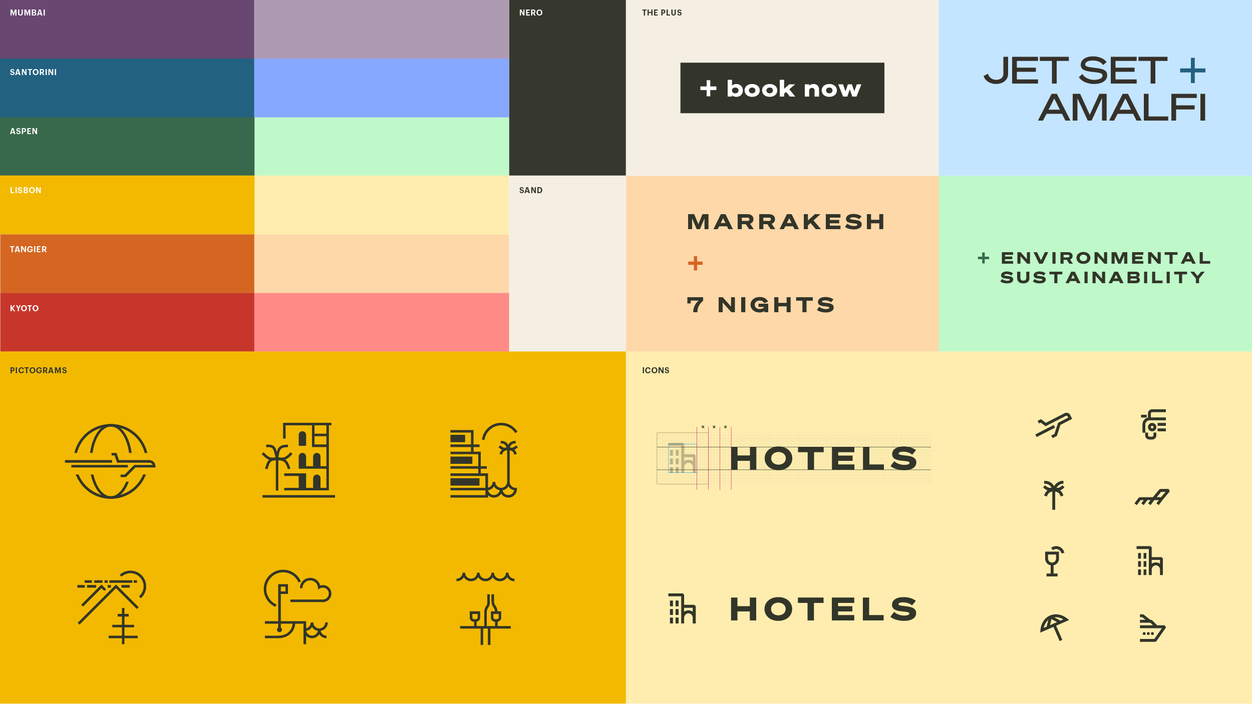
The Plus '+'
Leveraging the linguistic dichotomy built into the iconic name and logo, the '+' becomes a dynamic verbal and visual tool, allowing the brand to conjure up deep emotions and sentiments with simple, clever sophistication. The plus also becomes an iconc graphic mark, emphasizing call-to-actions and endorsing key concepts & ideas.
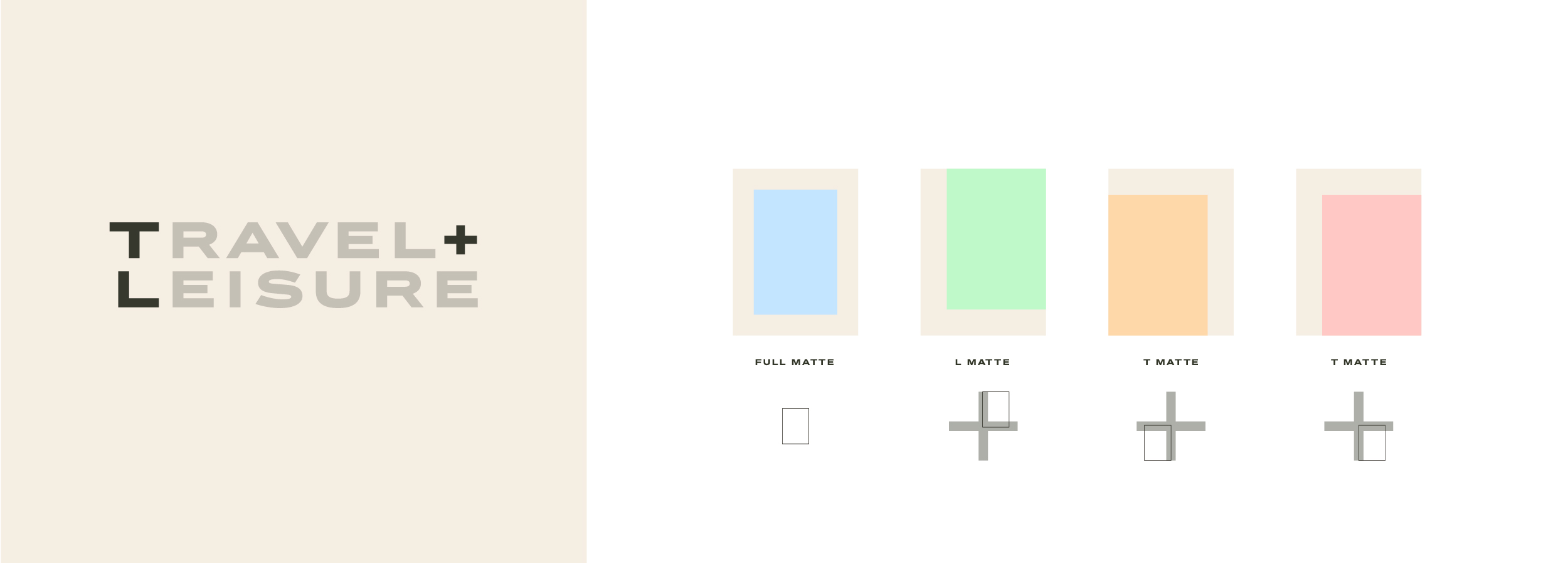
A signature composition system
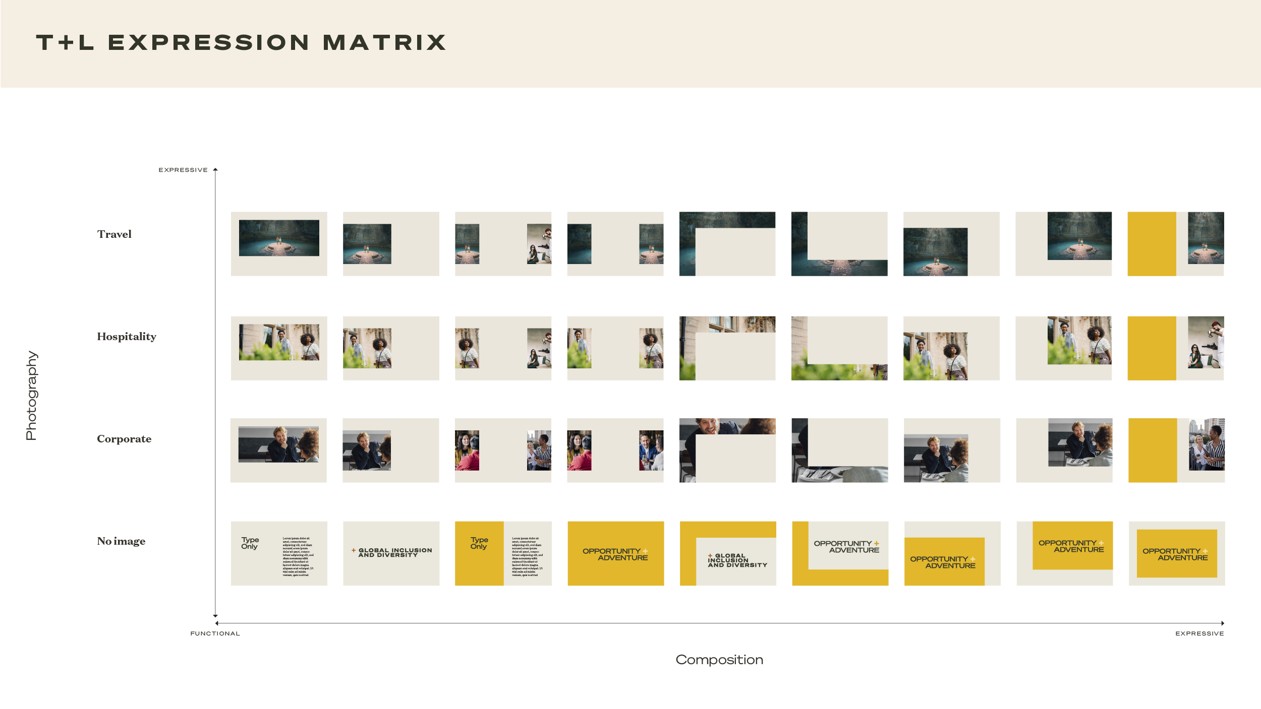
The signature 'T', 'L' and '+' elements of the logo become the foundational elements of an adaptive composition system. Their simple, geometric forms create a series of matte compositions, unifying layouts with the logo's formal characteristics, while also alluding to the margins on a printed page as a nod to the magazine's legacy.
To aid with implementation for internal teams, an expression matrix was created to demonstrate the range of layouts available and the contexts for which they are best suited.
Motion identity in two modes
In order to capture the essence of ‘travel’ and ‘leisure,’ we developed a motion identity system that harmoniously incorporates two distinct behavioral modes.
Travel mode—Immediate, decisive, seamless
Travel mode helps the viewer quickly grasp content, while moving seamlessly through functional information. Travel mode is also suited for telling fast-paced, adventure-driven stories and animating impactful headlines and CTA’s.
Leisure mode—Graceful, deliverate, contemplative
Lesiure mode immerses the viewer in the content, ideal for poetic storytelling, showcasing products and experiences, and providing inspiration.
End cards and matte activations
Titles & lower-thirds
Guidelines & implementation
To ensure the new brand was succussfully adopted and implemented into the global organization, we built comprehensive guidelines and conducted in-depth, remote training sessions with the client.
Copyright © Jaymes Moore 2011–2020