TWR—A Service Corporation
Chicago, IL USA
2012–2013
Brand Strategy
Visual Identity
Environmental
TWR is an industrial services company in the suburbs of Chicago specializing in electroless nickel, gold and silver plating. From 2012–2013, TWR underwent their first change in brand strategy and visual identity since 1975. The objective of the rebranding was to honor the traditions of a family-run business, while repositioning the brand as state of the art with an emphasis on service, quality control and environmental responsibility. The resulting visual identity reflects the operating principles of the business: clean, efficient and thorough.
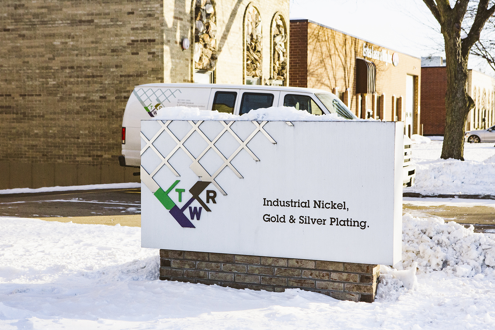
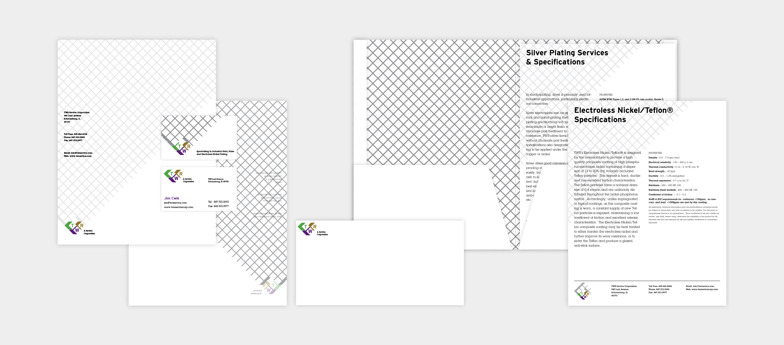
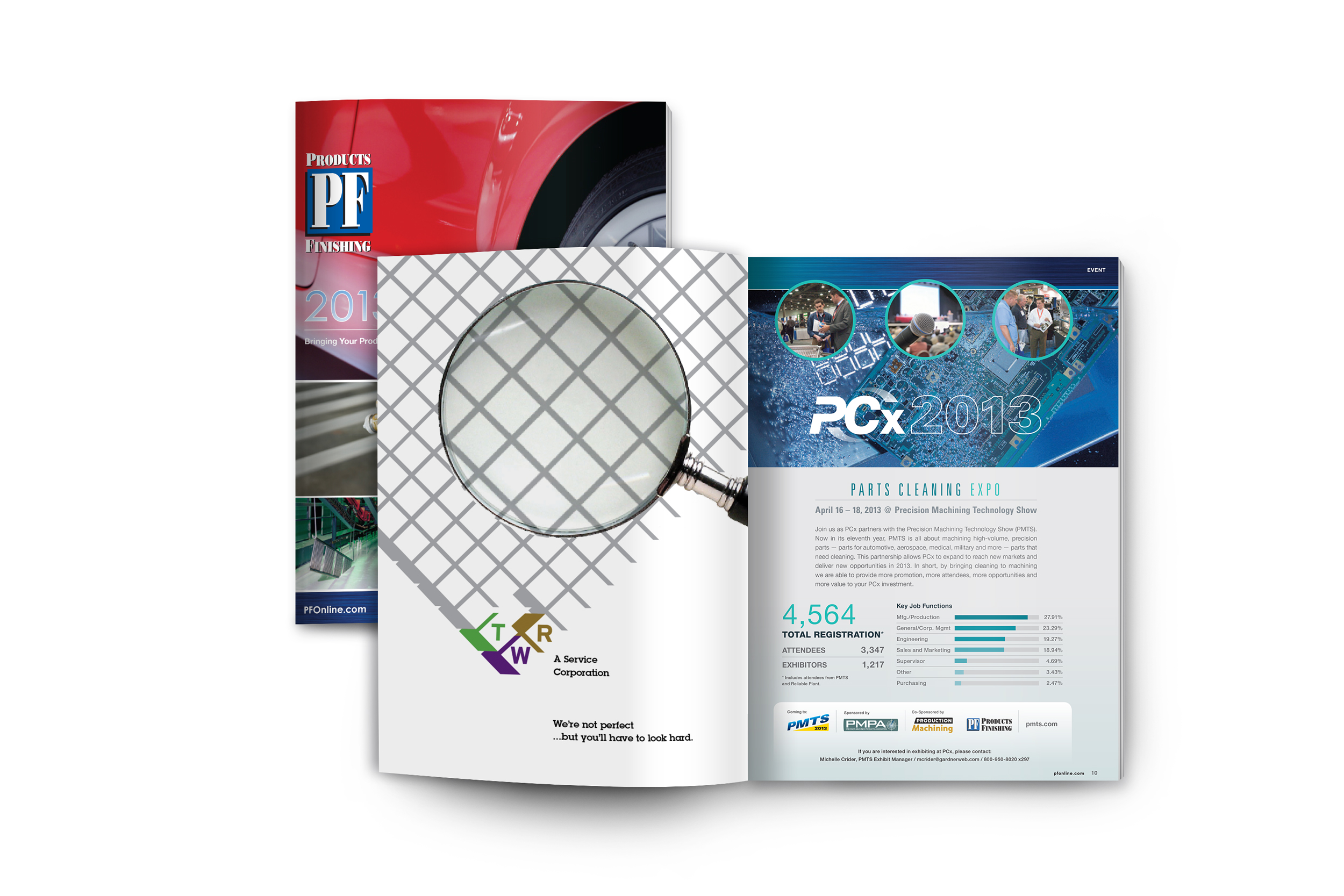
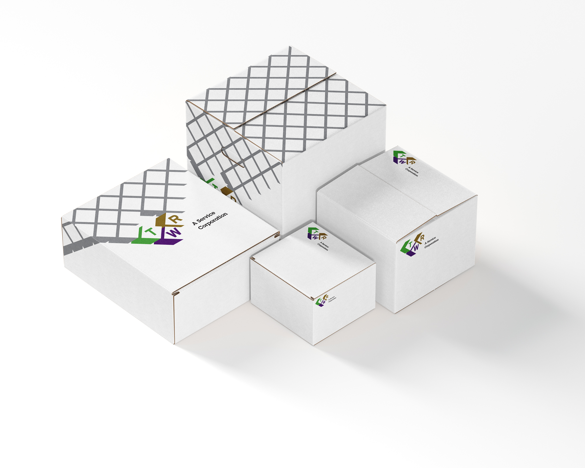
TWR is a standout in their industry in their ability to adapt to complex projects. Their superior technical expertise allows them to plate intricate surfaces and parts exposed to extreme elements for use in the aeronautical and medical industries. To convey this adaptability in the brand's message, a flexible tri-mark logo system was established permitting the seamless application of the visual identity to a variety of surfaces, from printed stationery to shipping boxes and delivery vehicles.
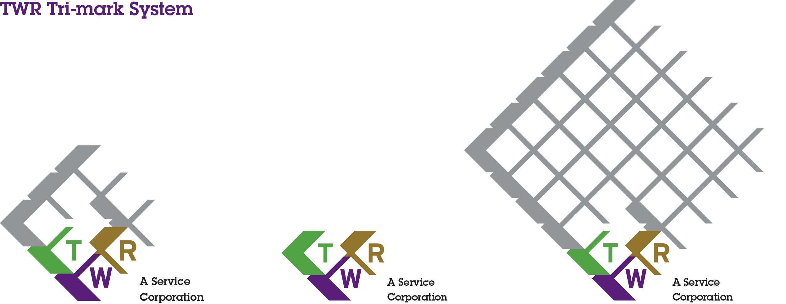
The primary mark is holistic and balanced, instilling a sense of forward confidence, while offering a deeper narrative upon further examination.
The mark can be reduced to just the core blocks for ease of application to envelopes and shipping materials.
The third iteration of the mark expands into an infinite pattern, effectively visualizing the plating of a surface.
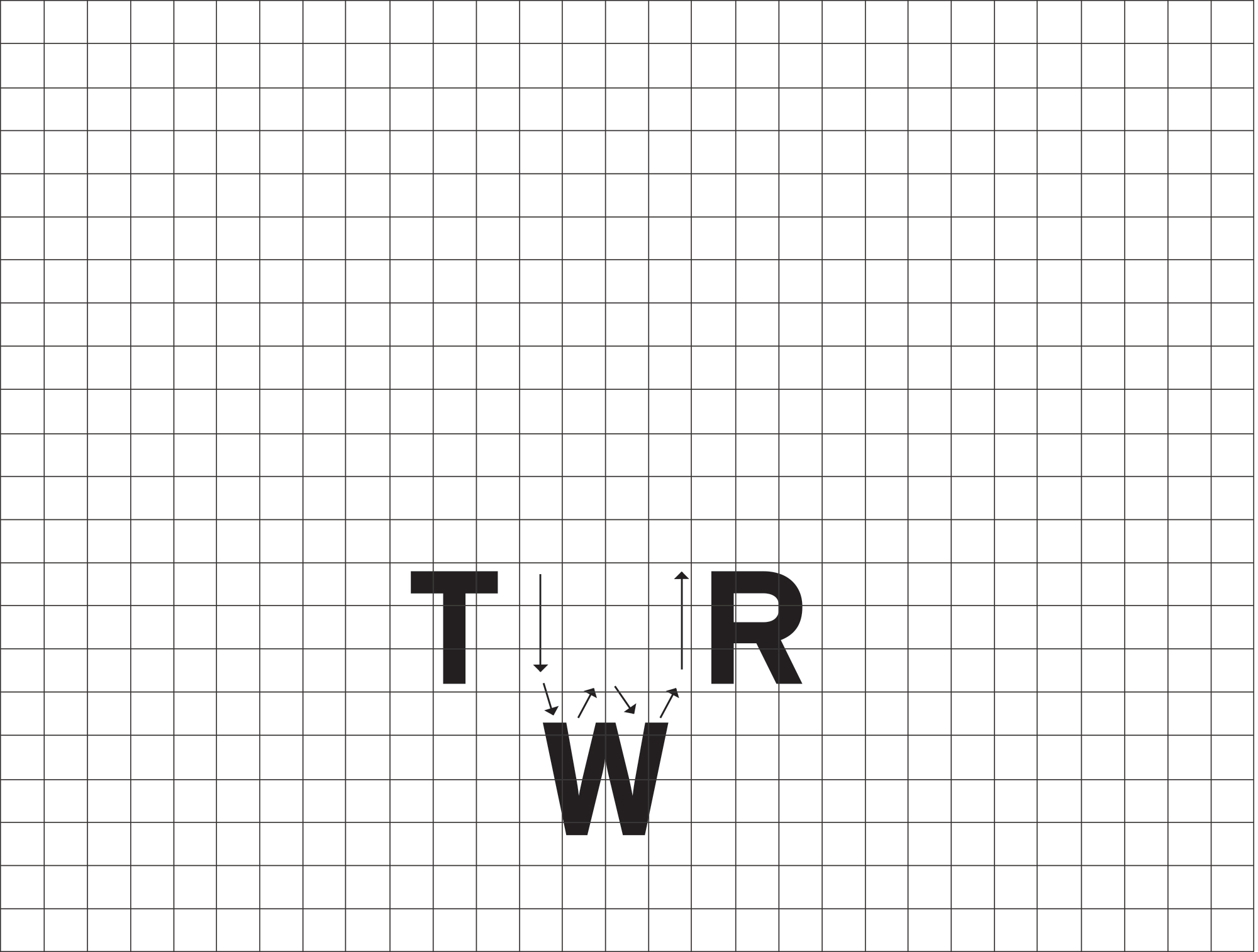
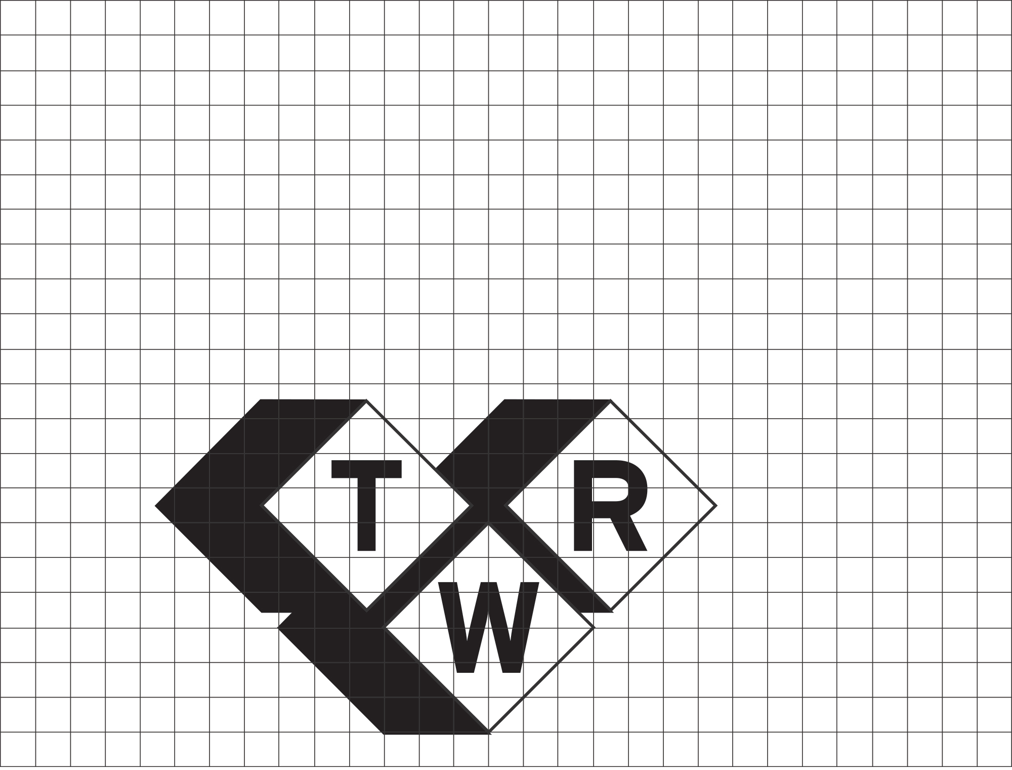
The mark is derived directly from the electroless plating process. Building off of the name recognition of TWR, the letterforms themselves became an instant source of inspiration. The ascending and descending features emulate the movement of a part being processed through the facility, lowered and raised through different plating baths.
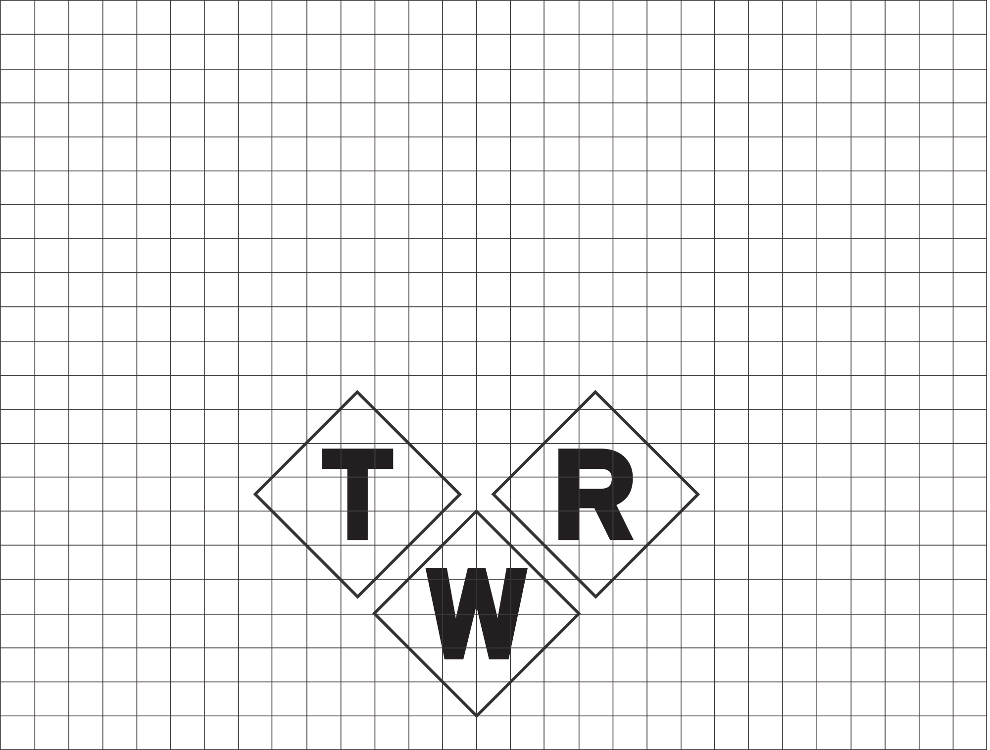
The letterforms are incased, paralleling their arrival at the cleaning and quality inspection phase.
The incasing forms are extruded to create subtle dimension, further emphasizing the relationship to the plating baths as well the final packaging.
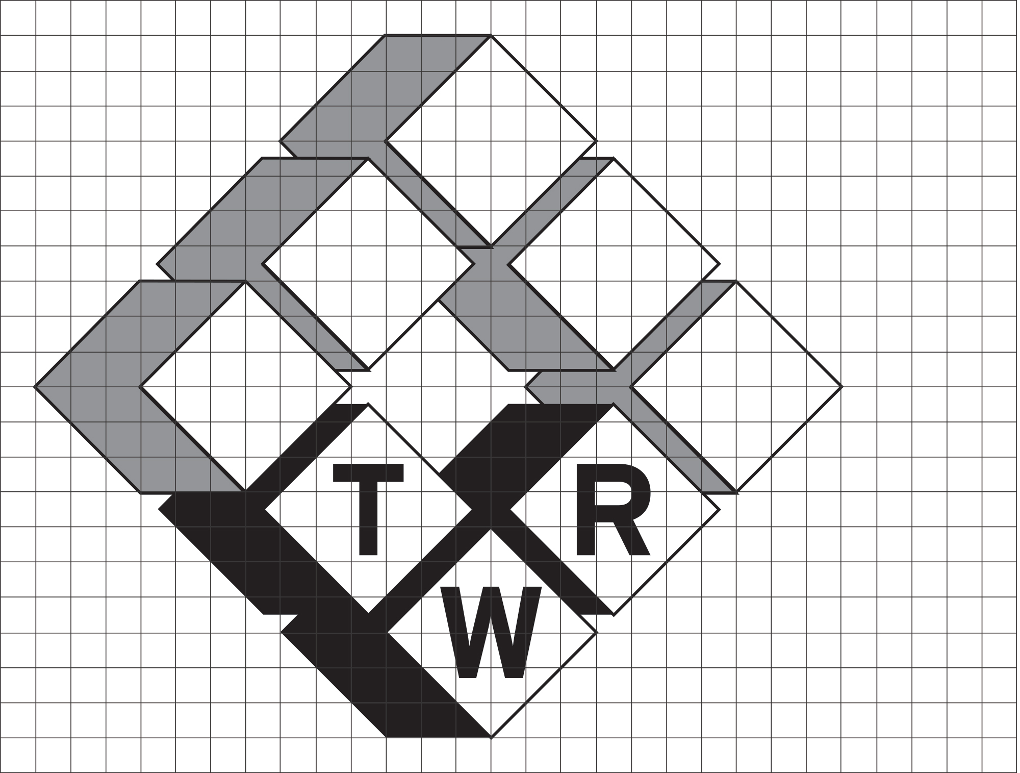
The extruded boxes are expanded to form the complete mark.
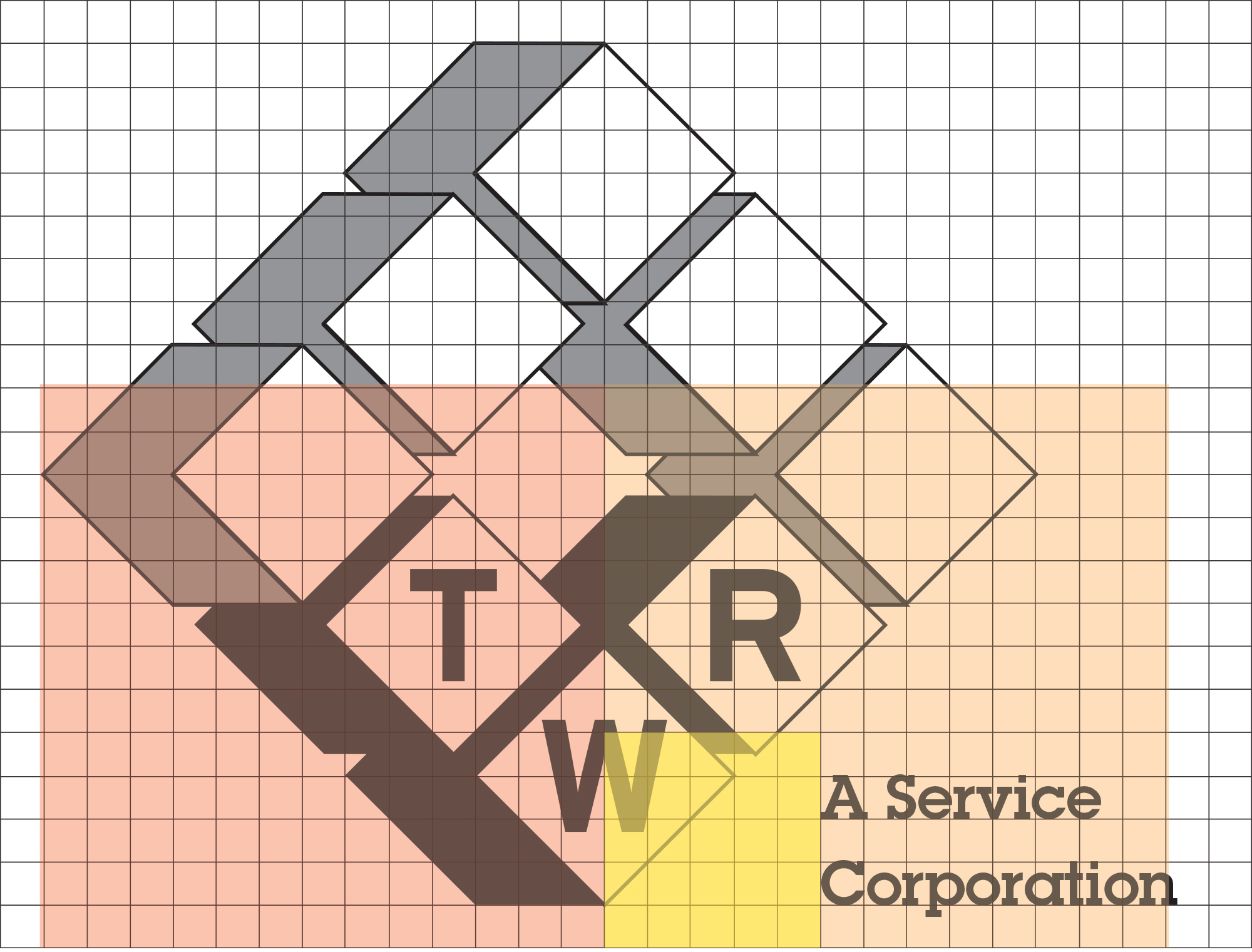
The company tagline is then carefully set within the mark's architecture.
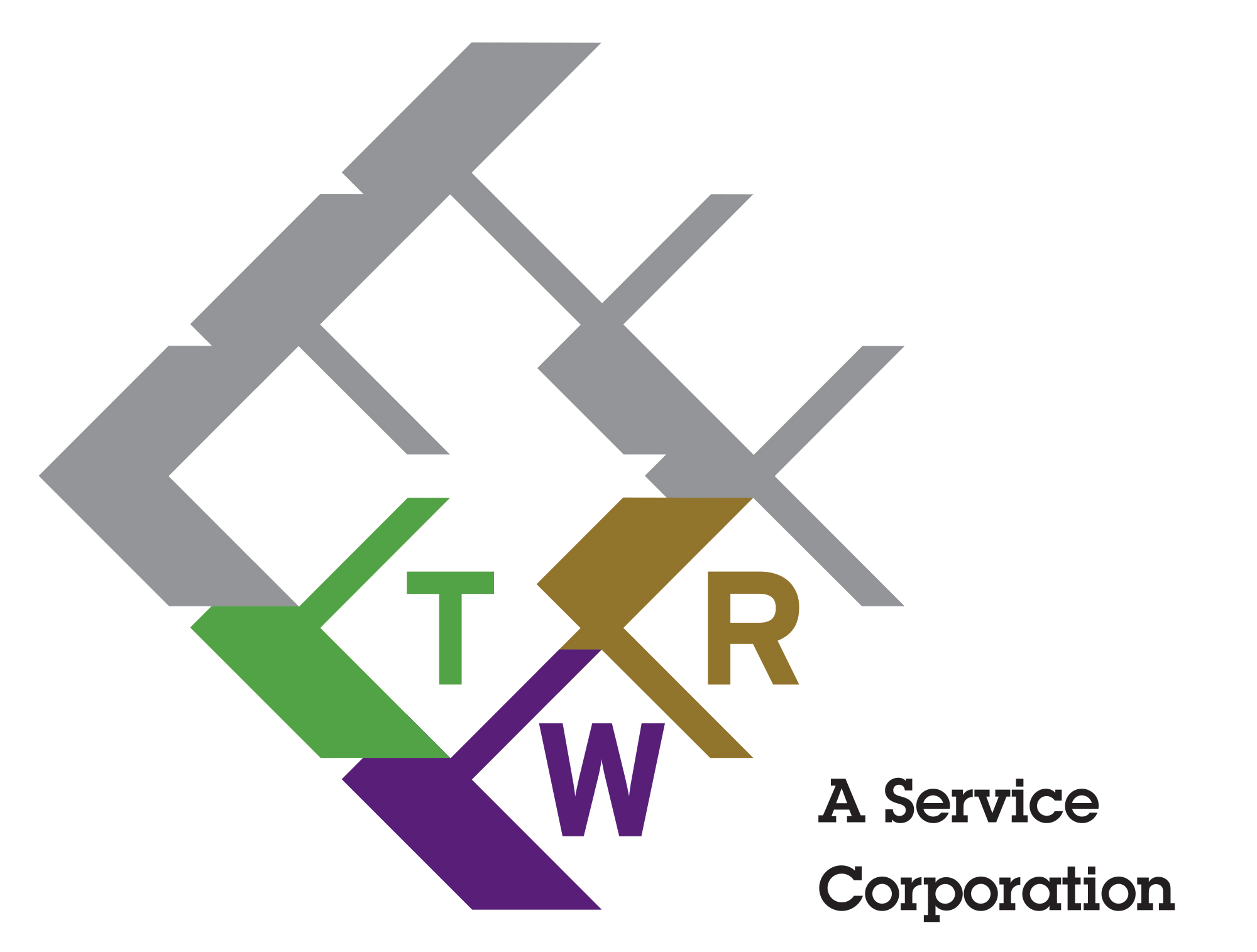
The addition of color to the core blocks not only brings emphasis to the company name, but completes the image of a raw metal part being dipped into a plating bath and having a new surface applied.

The colors used in conjunction with the mark were chosen specifically to reinforce the repositioning goals of the brand strategy. Green was chosen to represent TWR's commitment to environmental responsibility, as reinforced by their zero waste discharge facility and their rigorous adherence to EPA standards. Green is also the color of the water inside an electroless nickel plating bath.
After conducting a thorough visual audit of the industry, it was found that purple was the one color unused by nearly all of the competition. Traditionally regal and strong, TWR's purple functions as the primary corporate color and as an immediate point of differentiation.
Gold was chosen to represent the tradition and heritage of TWR, emphasizing the company's 40 years in business and their intention to be an innovator in the industry for decades to come. The specific color value was chosen to represent the raw, matte finish of industrial gold.
Copyright © Jaymes Moore 2011–2020