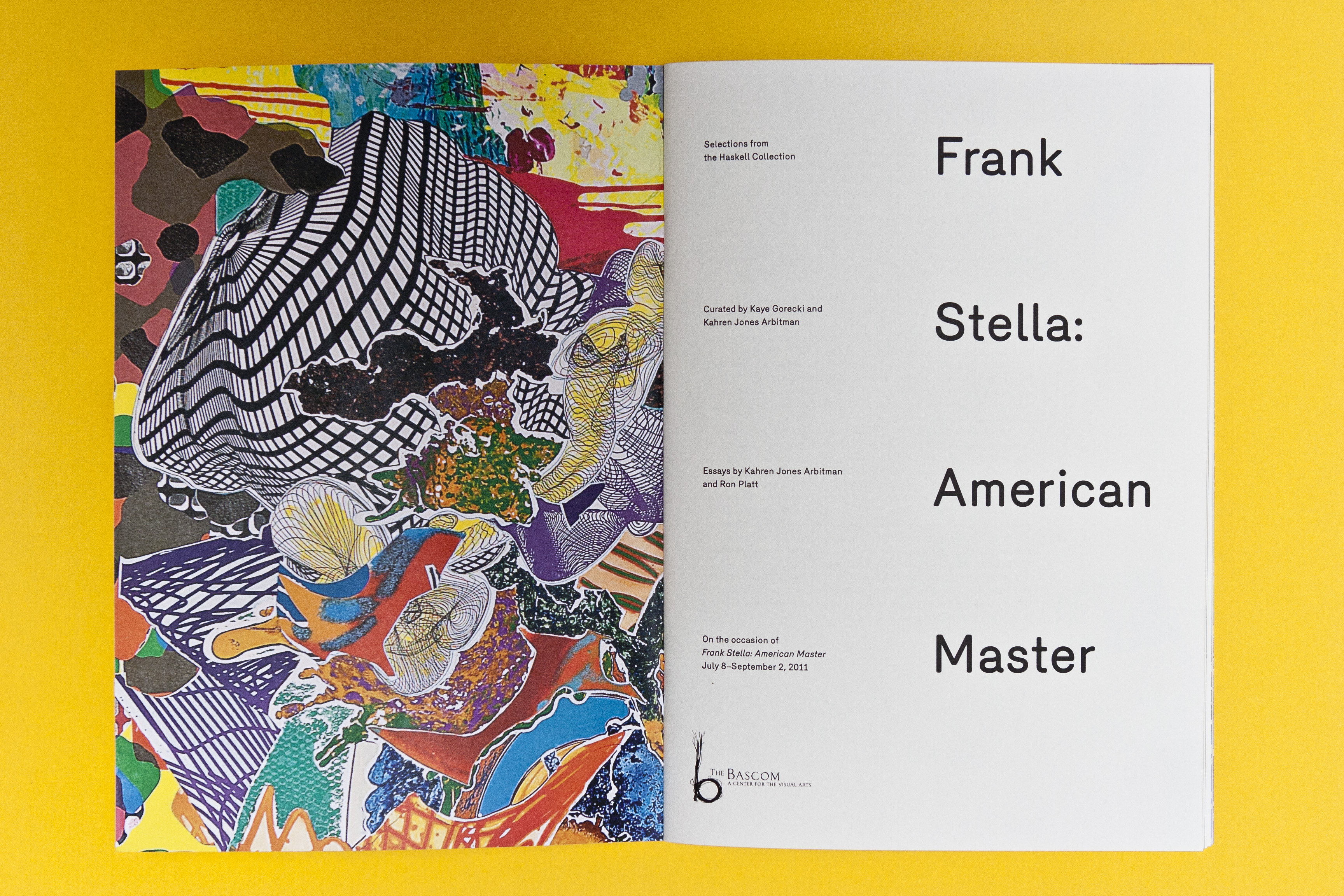
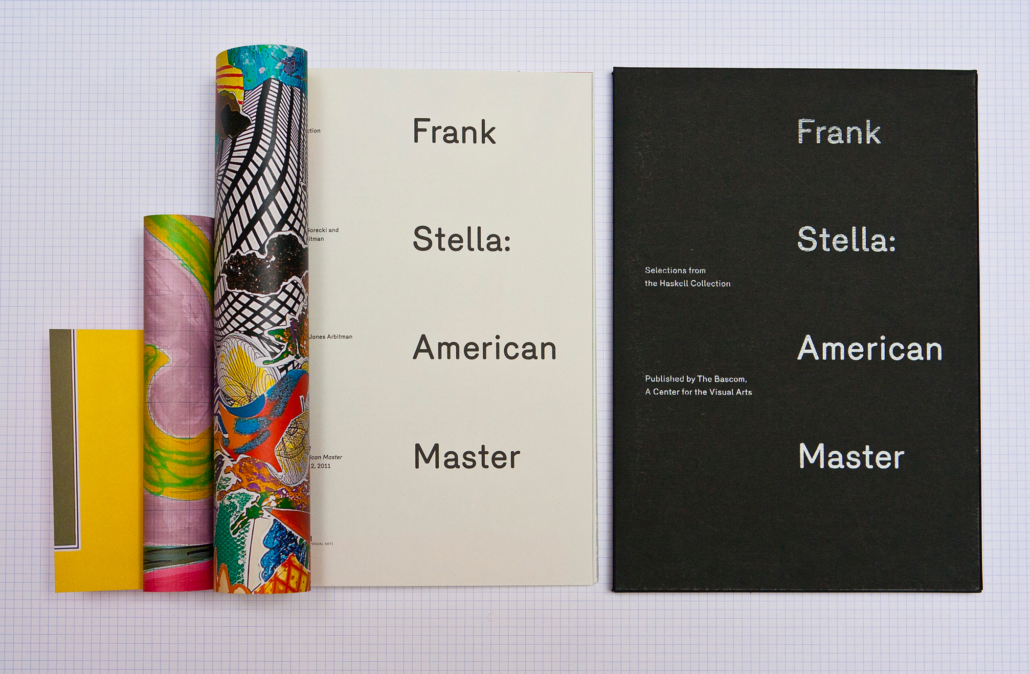
Frank Stella: American Master
ISBN: 978-0-615-50214-4
Exhibition of the Haskell Collection
at The Bascom, 2011
Pre-Press: Bussière
Printing: Desgrandschamps
Paper Specifications
Covers: Sirio White White 200gr.
Interior: Tintoretto Neve 140 gr.
Typeset in Merkury Medium
by Radim Peško
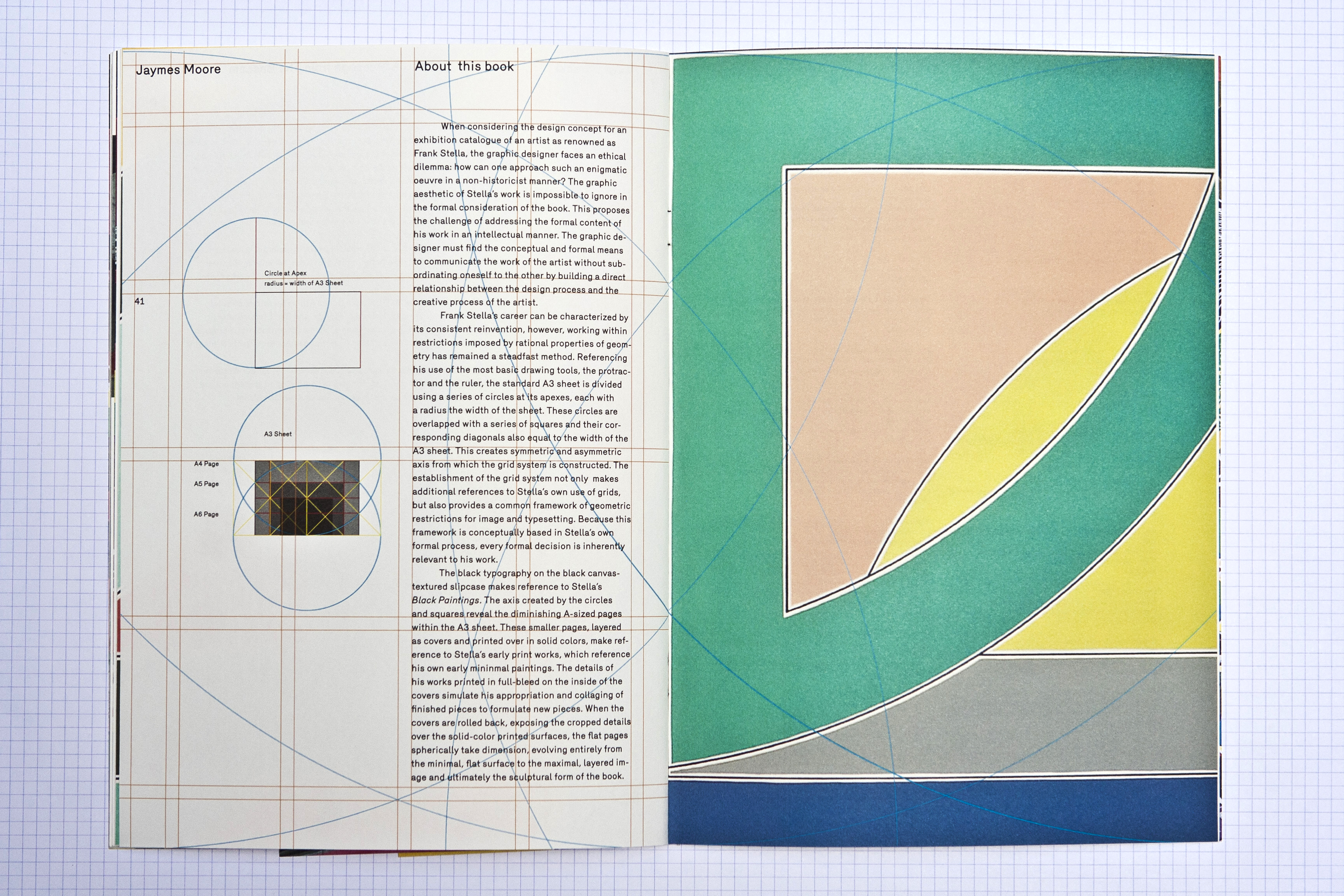
When considering the design concept for an exhibition catalogue of an artist as renowned as Frank Stella, the graphic designer faces an ethical dilemma: how can one approach such an enigmatic oeuvre in a non-historicist manner? The graphic aesthetic of Stella’s work is impossible to ignore in the formal consideration of the book.
This proposes the challenge of addressing the formal content of his work in an intellectual manner. The graphic designer must find the conceptual and formal means to communicate the work of the artist without subordinating oneself to the other by building a direct relationship between the design process and the creative process of the artist.
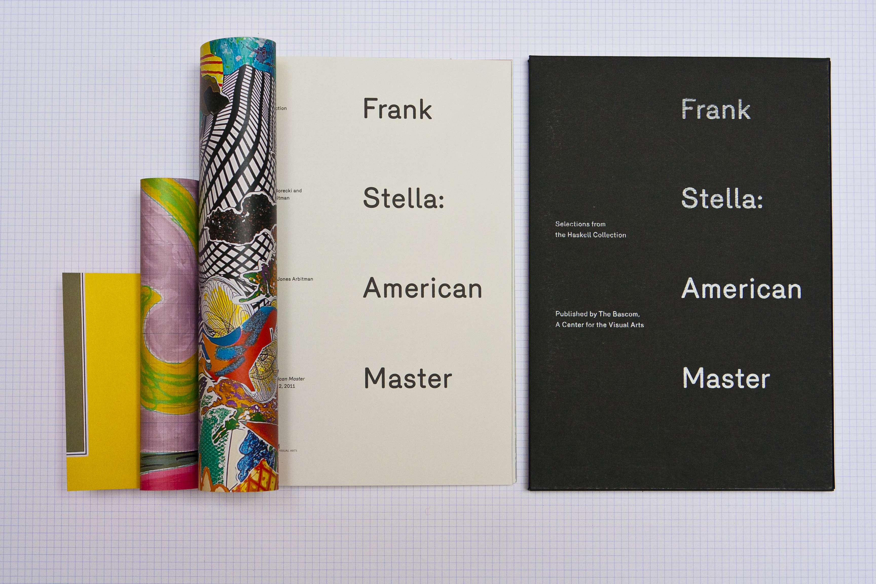
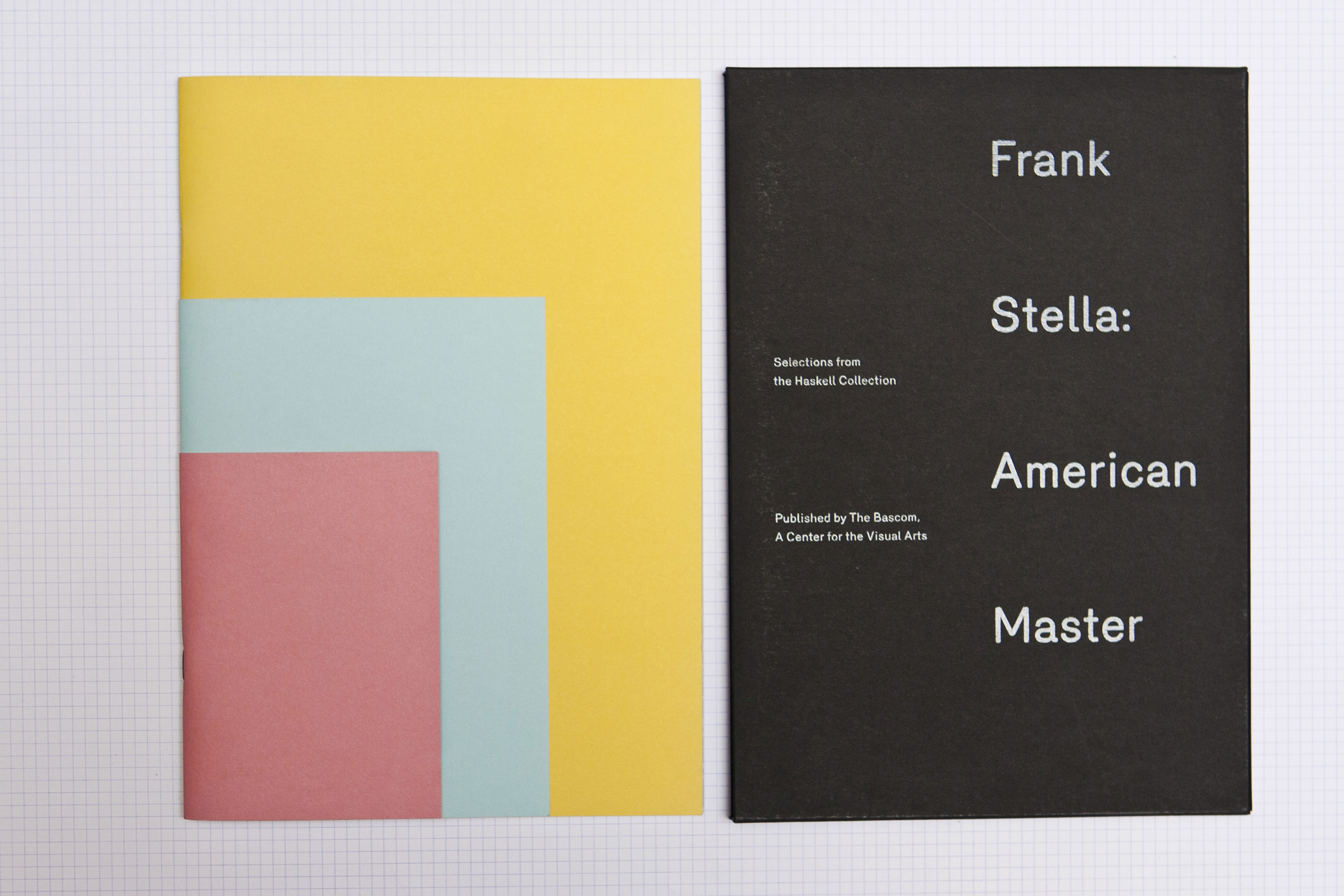
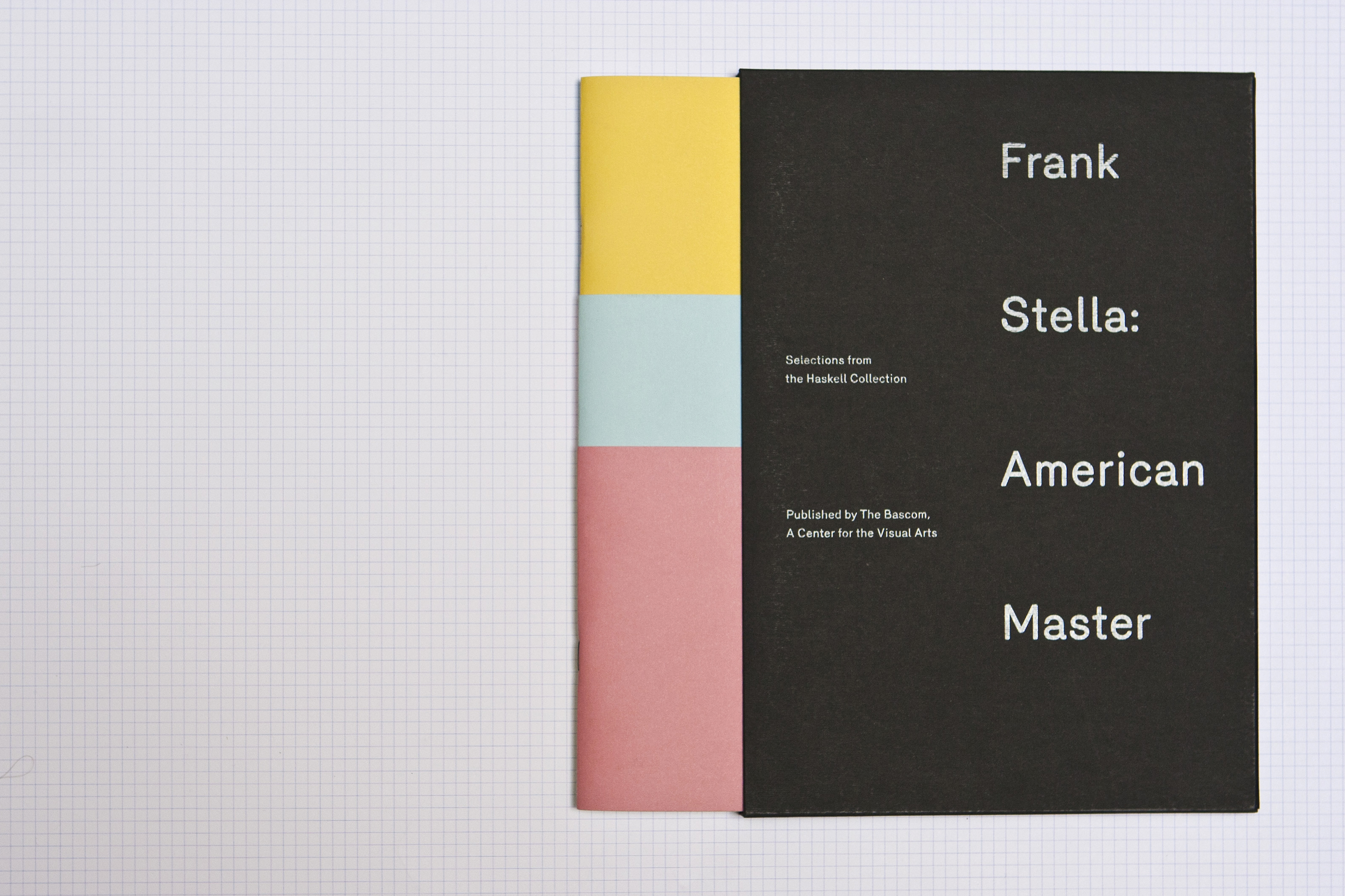
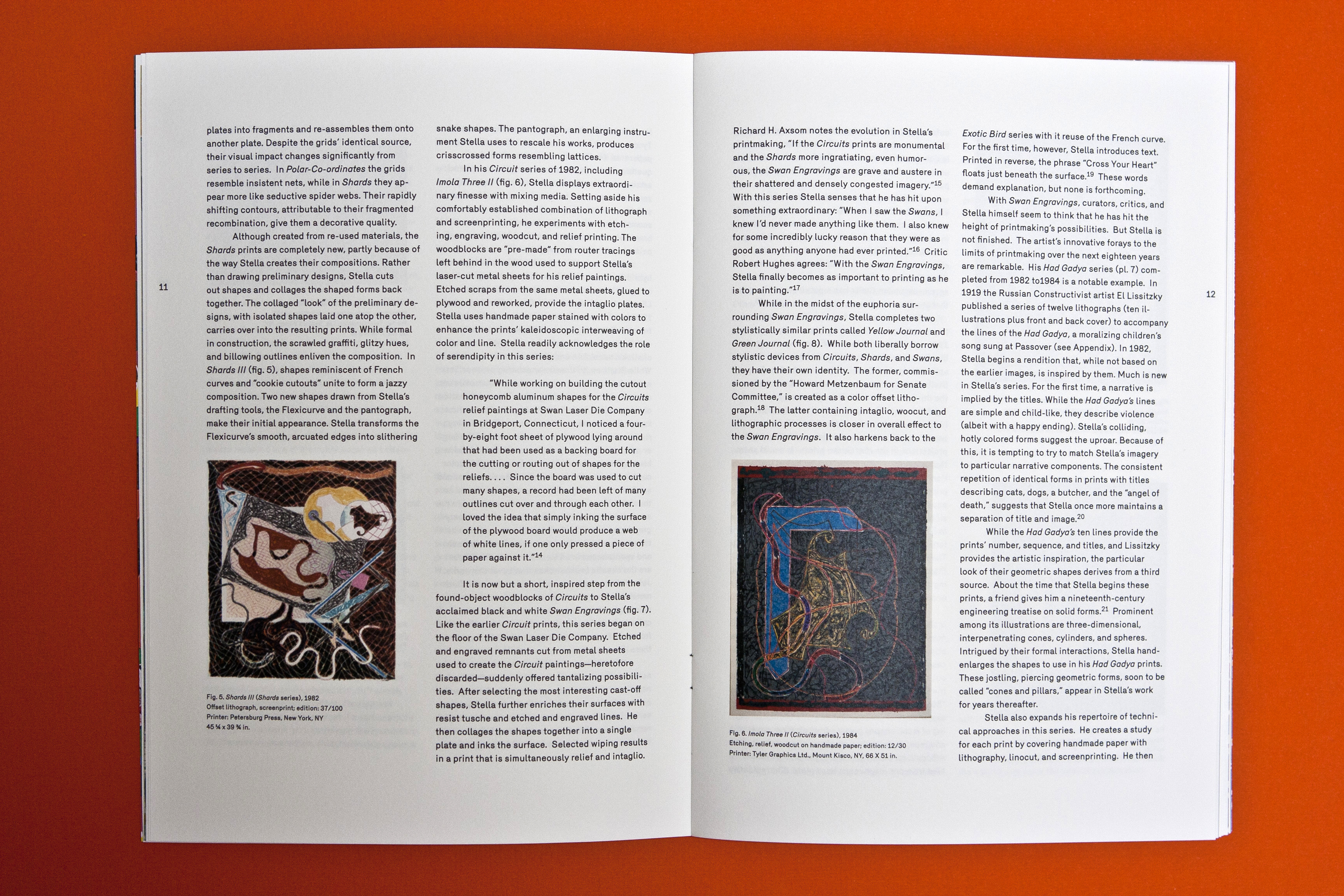
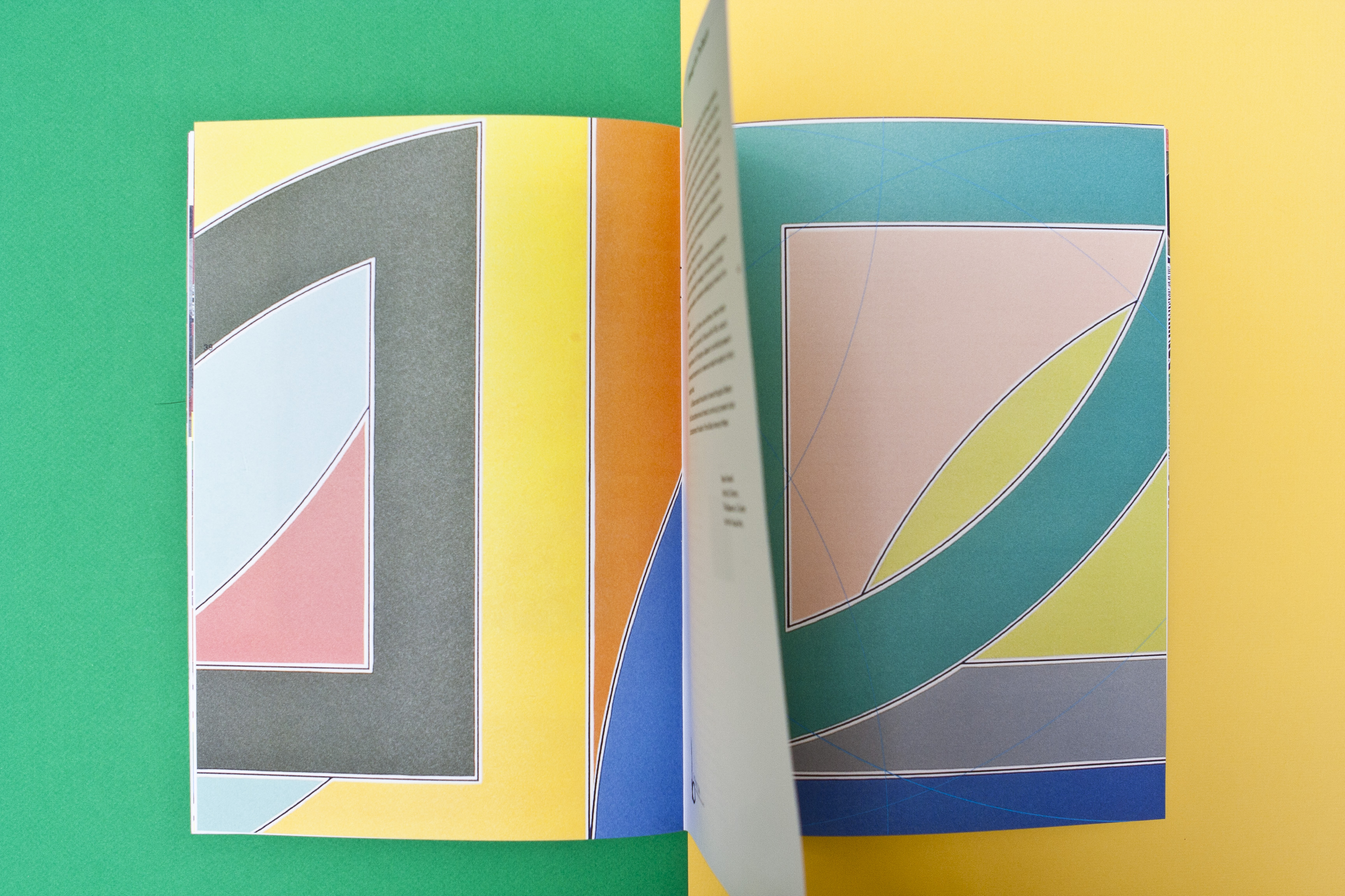
Frank Stella’s career can be characterized by its consistent reinvention, however, working within restrictions imposed by rational properties of geometry has remained a steadfast method. Referencing his use of the most basic drawing tools, the protractor and the ruler, the standard A3 sheet is divided using a series of circles at its apexes, each with a radius the width of the sheet. These circles are overlapped with a series of squares and their corresponding diagonals also equal to the width of the A3 sheet. This creates symmetric and asymmetric axis from which the grid system is constructed. The establishment of the grid system not only makes additional references to Stella’s own use of grids, but also provides a common framework of geometric restrictions for image and typesetting. Because this framework is conceptually based in Stella’s own formal process, every formal decision is inherently relevant to his work.
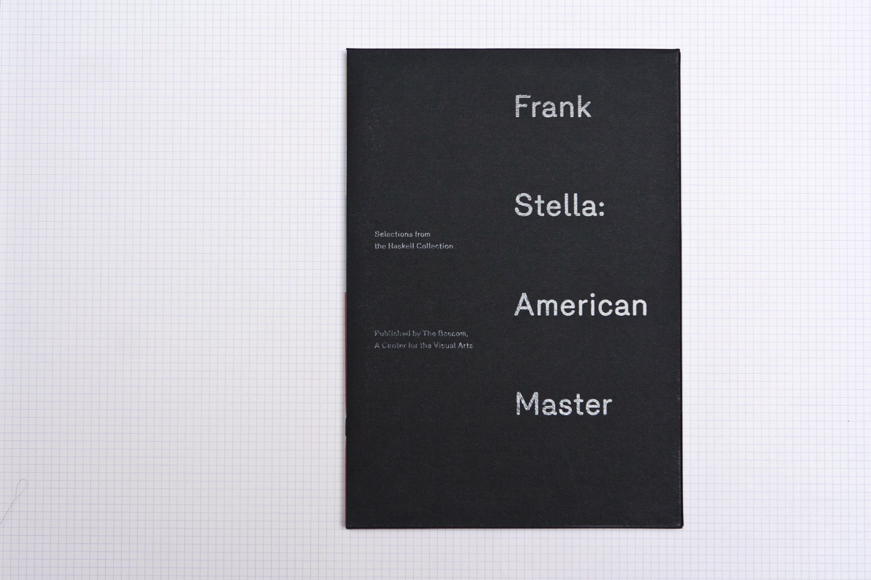
The axis created by the circles and squares reveal the diminishing A-sized pages within the A3 sheet. These smaller pages, layered as covers and printed over in solid Pantone colors, make reference to Stella’s early print works, which reference his own early minimal paintings. The details of his works printed in full-bleed on the inside of the covers simulate his appropriation and collaging of finished pieces to formulate new pieces. When the covers are rolled back, exposing the cropped details over the solid Pantone colors, the flat pages spherically take dimension, evolving entirely from the minimal, flat surface to the maximal, layered image and ultimately the sculptural form of the book.
Selected Works

LFDT x MTLVisual Identity

Lo Fi Dance TheoryVisual Identity

Wynn HolmesWebsite Design

La CommuneSpatial Design
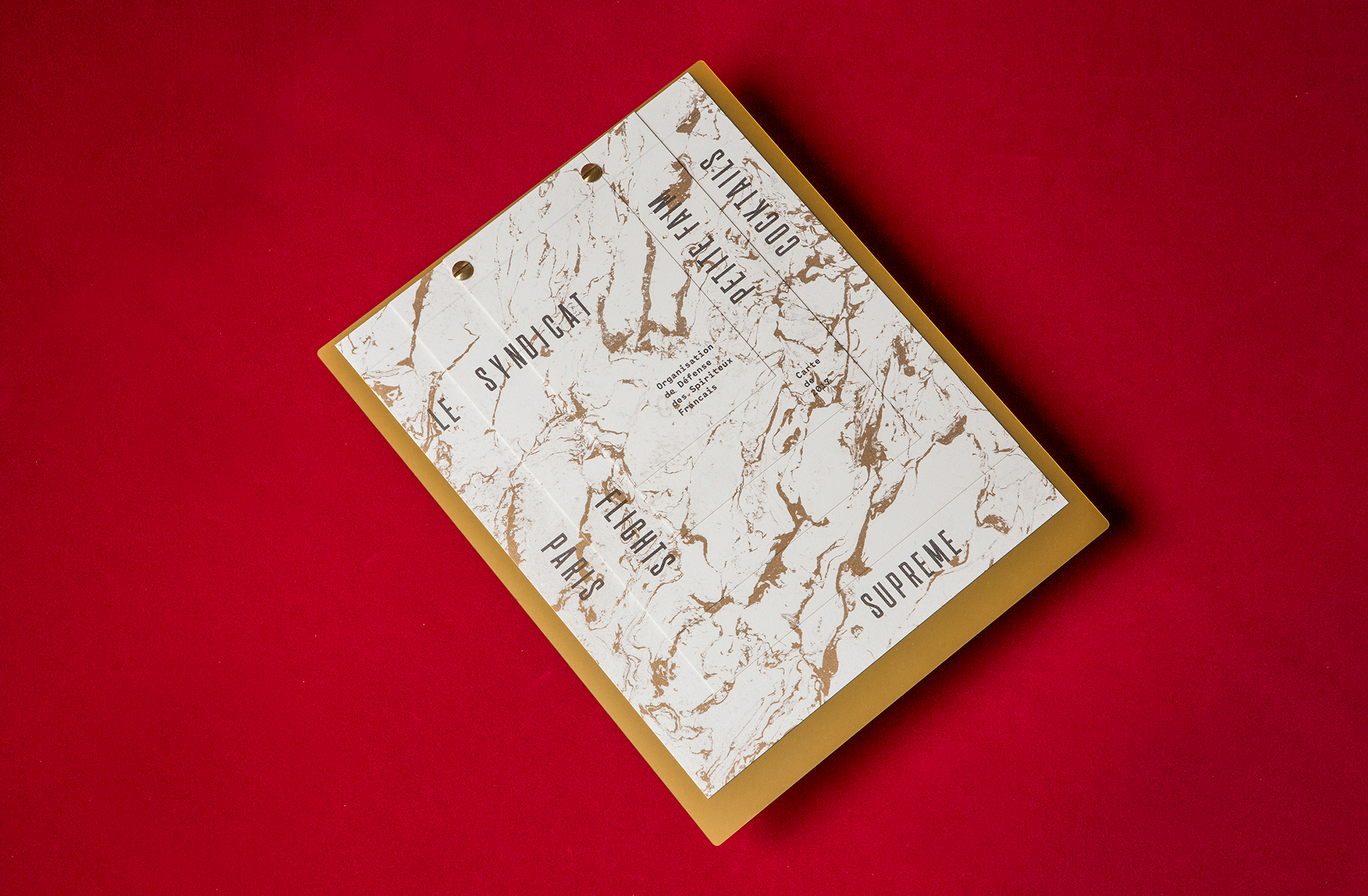
Le SyndicatMenu Architecture
Frank Stella: American MasterBook Design
Copyright © Jaymes Moore 2011–2020